• When posting, please be aware that artistic nudity is still nudity and not allowed under RpNation rules. Please edit your pictures accordingly!

    Remember to credit artists when using work not your own.

Closed code machine go 𝙗𝙧𝙧𝙧𝙧 (by uxie)


art by
arithm


Wᴀʀʀᴇɴ Bᴜʀɴs


(he/him)


ʙᴜɢʙᴇᴀʀ ʙᴀʀᴅs ᴡɪᴛʜ
ʙᴀɴᴊᴏs ʏ'ᴀʟʟ


I think I broke something :c For some reason the pictures in the latest one won't stay seperate? When I post a link, it copies whatever is in the img1 link box to both images

EDIT: Fixed it, bless her soul she's amazing

♡design by rabbitswarren, coded by uxie♡
 
Last edited:
Hi there! Your codes are ABSOULTUELY beautiful! I would like to request your services! I have a whole pool of characters and I would love to have you work your magic for one of them!

1604960482378.jpg

Tidbits!
-if your willing to do this that would be amazing!!! If not thats ok!

- could you make the "text here" portion scroll?

-for font you dont have to do what I did, I'm looking for something that looks handwritten because I'm going for more of a ID card vibe, but if you can't do that that's ok too!

-if you could make this mobile friendly thats mainly that's what I use.

-aaaaannnd if you have any cool little things you want to add to it feel free!

Thanks for letting me take up your time


accepted!


uxie ®


thank you for the request!! !
please expect a dm from me soon so we can discuss the code in further detail (*ノωノ)


art by
arithm


Wᴀʀʀᴇɴ Bᴜʀɴs


(he/him)


ʙᴜɢʙᴇᴀʀ ʙᴀʀᴅs ᴡɪᴛʜ
ʙᴀɴᴊᴏs ʏ'ᴀʟʟ


Hello! I'm so sorry, I looked around but I don't think anyone else can make it mobile friendly?? Ofc you can decline <3 <3

Fonts: TNR (header; smallcaps), Georgia (body) Adjust pt size to make headers more prominent than body text, probably by like 6-8pt
Colors: Shown in photo! They don't have to be exact. If you can, please make the body text lighter slightly than the header.
The play bar is for soundcloud music with a clickable youtube link <3
I need it to be mobile friendly if you can, with hidden scroll bar in the body text box.

View attachment 805241


The icons should be spaced evenly, just don't have good art equip rn :'c
The icons aren't clickable, just for show. They should be, from top to bottom, a Brain, A face/person, a thought bubble, and a heart

I was on mobile when I made the example, I'm so sorry! If something doesn't make sense, let me know.


♡design by rabbitswarren, coded by uxie♡


22. my babies


my babies


ic


hidden scrolls


uxie ®


please leave a like if you use ♡
please do not remove the credit.


this code was made in collaboration with Urzula Urzula !
please click the below to see their design!

a very simple mobile-friendly ic code for all of your posting needs! the code features hidden scrolls on the details box as well as the main text, and is (─‿‿─) mobile-friendly! as always, customisation has been made easy through the use of variables, and i've also left several comments along the way to make sure all your content is in the right place

thank you to urzula for the request!
hope you enjoy! (´ ω `♡)


– uxie


mood:

mood here ! mood here!


location:

this is what happens when you
type something kinda long-ish


tags:

@ some users


name name


Lorem ipsum dolor sit amet, consectetur adipiscing elit. Aenean consequat a mauris in porta. Vestibulum hendrerit suscipit ornare. Etiam a tellus auctor, mattis mauris vitae, gravida nisi. Praesent lobortis fringilla risus eu viverra. Maecenas sed justo sapien. Aenean et ex eu orci vehicula ultrices in eget nibh. Phasellus quis posuere lorem. Sed iaculis vehicula orci ac efficitur. Aenean justo tellus, malesuada sagittis finibus sit amet, aliquet quis velit. Curabitur ex sem, laoreet sed imperdiet imperdiet, porttitor eget quam. Integer maximus ante vel massa interdum varius. Donec molestie dui ac iaculis maximus. Cras odio felis, fermentum eu mauris quis, interdum semper sem. Maecenas tincidunt quis augue nec semper. Nunc a enim ac elit interdum placerat id et lorem. Nunc dapibus sed nibh ac volutpat.

Aliquam eleifend tellus eget libero rutrum sollicitudin. Phasellus condimentum quam purus, at pretium ipsum euismod ut. Nullam congue, mauris sed sagittis efficitur, enim enim fringilla dolor, nec pretium erat ipsum id tortor. Duis luctus ante mauris, quis venenatis odio scelerisque ut. Proin placerat ornare libero, vitae porttitor eros hendrerit dapibus. In ut hendrerit ex. Proin tristique, erat in pretium placerat, elit nunc volutpat massa, consequat finibus velit elit eu dui. Sed laoreet placerat nunc, a aliquam est volutpat sed.

Suspendisse ex urna, malesuada vitae massa eu, posuere tristique neque. Cras at tristique sem. Interdum et malesuada fames ac ante ipsum primis in faucibus. Nunc quis lacus eu ligula consectetur accumsan et nec odio. Curabitur fermentum tempus magna, quis aliquet risus. Quisque vel purus semper, pulvinar ipsum eu, laoreet augue. Sed luctus rhoncus ex, ut pretium augue.


you can put a quote here 2 lines max


♡design by urzula, coded by uxie♡
 
Last edited:
23. bloodied steel


bloodied steel


ic


hidden scrolls


uxie ®


please leave a like if you use ♡
please do not remove the credit.


this code was made in collaboration with RabbitsWarren RabbitsWarren !
please click the below to see their design!

i am speed... i have no concept of priorities.......
anyways, here's another mobile-friendly ic code! rabbitswarren might just overtake anni with his requests at this point, but that's okay! regulars are good (♡μ_μ)

this code is mobile-friendly, and features hidden scrolls and a mobile-friendly music player! just take note i had to jank it a lil bit so you'll have to click twice, but it works! yay o(>ω<)o as always, customise all colours by replacing the variables with your own hex-codes at the top of the code!

since the requester specifically asked for small-caps, for all those who don't want that, i've left a little note at the start of the code to tell you how to get rid of it!

hope you enjoy (´• ω •`) ♡


– uxie


"quote here
three lines
max"


mental state
this will expand!


feelings here


thoughts here


health here


name name


(pro/pro)


  • h


(click play twice!)


Lorem ipsum dolor sit amet, consectetur adipiscing elit. Vestibulum feugiat, orci id ornare euismod, purus leo lobortis sapien, tincidunt aliquam velit risus vitae nulla. Proin porta ante eu nulla iaculis tempus. Ut sit amet sapien non ante pharetra congue ut vel turpis. Suspendisse fermentum metus ligula, eget tristique ligula sollicitudin sed. Duis ac malesuada dolor. Quisque eleifend nulla massa, et elementum velit elementum in. Curabitur iaculis iaculis quam, eu lacinia quam cursus et. In hac habitasse platea dictumst. Sed sit amet sapien dolor. Etiam molestie tincidunt feugiat. Orci varius natoque penatibus et magnis dis parturient montes, nascetur ridiculus mus. Praesent dictum mauris sit amet ornare hendrerit. Ut blandit blandit viverra. Proin nec ultricies eros. Duis facilisis fringilla leo.

Mauris dapibus cursus nulla iaculis vehicula. Aenean id ante lacus. Vestibulum porta dignissim urna id porttitor. Proin pharetra risus massa, nec sollicitudin sem malesuada in. Phasellus nec nisl nisl. In molestie elementum nisl, vitae congue nunc cursus at. Donec mattis quam odio, eget faucibus tortor porta eget. Ut rhoncus lacus pharetra, tincidunt est in, accumsan sapien.


♡design by rabbitswarren, coded by uxie♡
 
Last edited:


art by
arithm


Wᴀʀʀᴇɴ Bᴜʀɴs


(he/him)


ʙᴜɢʙᴇᴀʀ ʙᴀʀᴅs ᴡɪᴛʜ
ʙᴀɴᴊᴏs ʏ'ᴀʟʟ


I really did get the order of Uxie prime oh my,,,

Thank you for a wonderful speedy delivery again!!! I appreciate it more than you know.

♡design by rabbitswarren, coded by uxie♡
 
A request if you have time ^^

WC56KVA.jpg

UHhdukR.jpg

pTgZZ3s.jpg

Cwl1TjO.jpg

-notes-
-Where it says "Title Here" would be a clickable that takes to the "About" section
-background image can be found here Photo by Roksolana Zasiadko on Unsplash
-icons gathered front Font Awesome, but they don't need to icons if that doesn't work out. If icons aren't able to be used, I would simply like them to be words that direct back to each respective section
-House icon would direct back to the title page, address book icon would direct to "about" section, pencil icon would direct to "roles" section, scale icon would direct to "rules" section
-all of the text boxes would have hidden scrolls
-fonts used: Cinzel for titles, Karla for all other text


accepted!


uxie ®


thank you for submitting a request! (@^◡^) please expect a dm shortly with more details!


24. veiled woods


veiled woods


interest

tabs


hidden scrolls


uxie ®


please leave a like if you use ♡
please do not remove the credit.


this code was made in collaboration with specters specters !
please click the below to see their design!

yay! another uxie prime delivery! (; ω ; )

this is a nice little interest check code that features tabs as well as hidden scrolls on every text box! it's deceptively simple..... to make this code i actually had to layer two tabs together to make the layout work, but everything was okay in the end ( ˙▿˙ )

just note when editing the main title, you'll need to make sure you write it on both cover pages. i've left a note in the code too in case you forget. so please do not, or one of your titles will just be "title here!"
thank you to hekaton for submitting a request!

hope you like (♡˙︶˙♡)


– uxie


  • title here


♡design by hekaton, coded by uxie♡
 
Last edited:
25. ace of spades


ace of spades


cs


tabs

hidden scrolls


uxie ®


please leave a like if you use ♡
please do not remove the credit.


this code was made in collaboration with iridescent. iridescent. !
please click the below to see their design!

another private request from dreamglow, this time for a cs for her roleplay! thank you for giving me more business luv x
it's a pretty cool roleplay, so you should go check it out too!

it's cards inspired, and features a number of pictures and hidden tabs on the left side! you can, of course, change all the colours still, but since it's cards... .. well, there are some funky card sets out there.

hope you enjoy (⌒▽⌒)♡

p.s. keep ur eye out on something Speshul coming
p.p.s. stan svt they look so good


– uxie


  • H


    P


♡design by dreamglow, coded by uxie♡
 
Last edited:
I'M BACK HI I COULDN'T RESIST UR BEAUTIFUL CODING SKILLS

this one is shorter than my other one heh, but it's an interest check this time, instead of a cs. here is le design:

Azt96h9.png
1Mn9lj8.png
BQ0Sqca.png

general:
- like before, i'd love it if the grey background could fill the entire page, but the main part of the code (the white box) could be medium sized.
- this does not need to be mobile friendly, i won't subject you to that torture bc i know i'd be tortured if i had to do it askdjhas.

colours:
- main accent colour: #45b4ce
- background colour: #f6f6f6
- secondary background colour (the box): #ffffff
- border for main box + thick line that goes behind the tabs (the timeline part thingy basically): #eeeeee
- main text colour: #444444

fonts:
- main heading + number + role name font: oswald
- tab heading fonts: montserrat
- body font: karla

tabs:
- no tab icons this time around! just lil coloured buttons.
- if the hidden scrolls aren't too much trouble for u like in the last one, then that would be cool! don't worry about it if it's a hassle tho.
- for the role tab, i wanted it all to kinda connect, like in the spoiler below, if that's possible? if not then just squares and text and role name is all good!

X8Mmvhq.png
- aaaand i think that's it! i can't tell if i'm forgetting anything but tysm if u accept!! u are a queen and i will keep reminding u of that.


accepted!


uxie ®


thank u for submitting another pretty pretty request luv (o´▽`o)

i won't let u down ( ´ ω ` )ノ゙


26. delphinium


delphinium


interest

tabs

hidden scrolls


uxie ®


please leave a like if you use ♡
please do not remove the credit.


this code was made in collaboration with natasha. natasha. !
please click the below to see their design!

another collaboration with nat! her designs are really, really to die for. gosh, so much love

this is an interest check code features fancy tabs, hidden scrolls! shameless plug for her roleplay here too: click me it's really cool check it out!!! ! or like... don't too bc i don't want that competition 😳
unfortunately! this code isn't mobile-friendly, since these tabs are too fatty! so infuriating, but at least my coding has improved to the point that i think i'd be able to recreate most of these in mobile-friendly forms when bbc+ returns. maybe...,. but that's Effort....

anyways, it's a hopefully pretty user-friendly code! i've left comments to help you along as always!

hope you enjoy ♡(。- ω -)


– uxie


begin again


filler!


filler!


filler!


filler!


  • so, what's the story so far?


    Lorem ipsum dolor sit amet, consectetur adipiscing elit. Curabitur placerat justo vitae odio aliquam, at suscipit mauris ullamcorper. Maecenas eleifend ut lorem sed ornare. Aenean turpis elit, aliquam ut viverra a, efficitur et risus. Suspendisse sed lectus ac urna posuere consectetur. Sed dapibus, erat at tristique suscipit, quam velit scelerisque nisl, at bibendum nisi magna vitae sem. Phasellus varius auctor tristique. Praesent ac turpis massa. Morbi magna lorem, feugiat quis purus a, tempus efficitur nulla. Sed auctor suscipit sapien, non facilisis sem. Donec placerat, mi et hendrerit lobortis, ipsum odio condimentum risus, nec eleifend ex diam eu sapien. Mauris at dolor molestie, pellentesque felis at, malesuada purus. Nam finibus nibh malesuada, accumsan ex vitae, euismod justo. Nunc malesuada diam in nisl tincidunt, vitae lacinia odio convallis.

    Vivamus semper posuere purus, ut egestas felis suscipit sed. Pellentesque tincidunt in est sit amet lobortis. Nullam sodales iaculis enim, quis pharetra nisi tristique vel. Lorem ipsum dolor sit amet, consectetur adipiscing elit. In hac habitasse platea dictumst. Duis blandit sollicitudin luctus. Sed sagittis, dolor nec fringilla iaculis, tellus quam dictum ante, vel scelerisque magna mi nec est. Etiam pellentesque arcu eu tristique porta. Class aptent taciti sociosqu ad litora torquent per conubia nostra, per inceptos himenaeos. Donec commodo ipsum ut sapien rhoncus, vel malesuada mi molestie. In auctor arcu enim, vitae consequat urna interdum nec.

    Nullam sagittis laoreet est, id iaculis risus euismod et. Lorem ipsum dolor sit amet, consectetur adipiscing elit. Class aptent taciti sociosqu ad litora torquent per conubia nostra, per inceptos himenaeos. Praesent pulvinar maximus nulla, vitae pellentesque tortor vehicula sit amet. Quisque fermentum purus in diam tempus, suscipit egestas urna vestibulum. Sed varius ipsum elit, ut pretium velit efficitur sed. Mauris sollicitudin lacus id varius vehicula. Morbi blandit sodales turpis, a feugiat arcu mattis eu. Nam vitae risus ac neque finibus semper id eu mauris. Maecenas blandit consectetur libero at placerat. Morbi egestas lobortis enim, at lobortis arcu elementum quis. Donec ullamcorper pharetra accumsan. Etiam placerat pretium laoreet. Etiam vitae cursus odio, a ultrices sem. Phasellus blandit enim at felis cursus, id hendrerit sem faucibus. Donec sit amet laoreet tellus, sit amet scelerisque erat.


♡design by natasha., coded by uxie♡

 
Last edited:
thank you my queen for bringing this to life with your talent!!! i love love love it so much and u already know imma be back hehe <3 <3
 
DID I TELL YOU I'D BE BACK?? HELL YES

ok this is... i think... complicated, so if something isn't possible or too complex pls let me know bc it can easily be changed!!

lP8S7cP.jpg

cKmXgRQ.jpg

1U38dHQ.jpg

ZTfYYEW.jpg

ADZtKSs.jpg

general:
- i think it's my signature aksdjhas but i'd love it if the grey background could fill the entire page. as for the main code, in my design it fills the entire page but i think rpn is much wider so keeping it medium and in the centre works! whichever you think would be easier to work with.
- as always, this does not need to be mobile friendly. < 3 < 3

colours:
- main accent colour: #b9cc83
- background colour: #f4f4f4
- secondary accent colour (used for border for all the text boxes & wherever else grey is used except for the background): #dddddd
- text box: #ffffff with the border mentioned above
- main text colour: #444444

fonts:
- main headings: oswald
- subheadings: montserrat
- body font: karla

tabs:
- so, wherever there's a star, i'd love for that to be an editable fa-icon!
- like the other one, if you can do hidden scrolls, that would be awesome!! but it is not required if it becomes too complicated.
- for the history tab i'd like it if it could have another set of tabs? like this below (but if it's too complicated then tell me and i'll remove the timeline and add something else aksjdha

ZTfYYEW.jpg

2uGAgns.jpg

qWiC6xJ.jpg
- for the likes & dislikes part, i'd like sticky headers pls! for the history tabs where the main content is, just static headers.
- and i think that's it!! ooof if this is too much pls let me know. ty if you accept and ilysm U QUEEN


accepted!


uxie ®


yes ma'am i'll get right on it ma'am
(ノ´ヮ`)ノ*: ・゚

do you even have to ASK if your designs won't be accepted gjkhjgf


27. chartreuse


chartreuse


cs

tabs


hidden scrolls


uxie ®


please leave a like if you use ♡
please do not remove the credit.

edit (07.12): i am a dum-dum, the second image on the persona tab now actually shows up.

this code was made in collaboration with natasha. natasha. !
please click the below to see their design!

i finally made it to page two of the private thread ( 〃▽〃)

thank you to nat for submitting yet another amazing design! the codes always end up huge and long, but so satisfying to complete. look at those tabs!!!
this is a character sheet code featuring hidden tabs, hidden scrolls and a music player! there are hidden scrolls on almost all text boxes (the ones without are mentioned specifically in the code), and note that the timeline in the history tab are actually tabs themselves.

the effect is SO COOL (((o(*°▽°*)o))) like, nat's brain is so big i can't

anyways it's another one of those hefty, hefty codes that go on for like 3 yrs when u copy it over, so please be careful! i've left comments where everything should go so hopefully you should have no issue using it!

enjoy (⌒▽⌒)♡


– uxie


filler! ignore


filler! ignore


filler! ignore


filler! ignore


  • Lorem ipsum dolor sit amet, consectetur adipiscing elit. Curabitur et posuere felis, eget elementum diam. In luctus auctor libero eu ultricies. Suspendisse vehicula vehicula massa vitae viverra. Etiam venenatis libero non mattis tincidunt. Quisque tempor, libero dapibus porttitor cursus, dolor


    a quote would possibly come here


    requisite


    name of the song


    name of the artist


    character name here


    character name here


    character name here


    character name here


    character name here


♡design by natasha., coded by uxie♡
 
Last edited:
AS ALWAYS I AM BLOWN AWAY BY UR TALENT Uxie Uxie !! it's absolutely perfect! thank you so much!! ily <3
 
surprise im back bitch

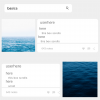
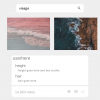
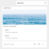
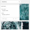
okay so i designed this summery code even though its winter sue me

design:
1.png

2.png
3.png
4.png
5.png

yes, as you've guessed, it's a tumblr based code.
a few things
- def want tabs for sure but im not sure where/the best place they should go. surprise me
- for the title page, i'd love for the magnifying glass to be the thing you click on to take you to the main page, if possible
- fonts: helvetica neue roman and helvetica neue bold
- all of the text boxes are scroll boxes if possible
- color scheme: gray, white and blue (basically white and gray plus ocean pics lol)
- where it says "userhere" on each page, would you mind underlining it? my laptop didn't wanna cooperate heh

that's all thank you!!! uwu


Last edited:


accepted!


uxie ®


not by business consistingly only of my friends at this point LMAO

but yes of course your request is accepted! thank u 4 submitting
let's get feral wit it (ノ´ヮ`)ノ*: ・゚


28. swim good


swim good


cs

tabs


hidden scrolls


uxie ®


please leave a like if you use ♡
please do not remove the credit.

edit (03.12): fixed the link of the little flashing text thing on the cover page!

this code was made in collaboration with iridescent. iridescent. !
please click the below to see their design!

i could've made this mobile-friendly but i got way too lazy so i'm sorry to all mobile users.. . .once more i have failed to include you (╥ω╥)
i will do it when i have the energy to....

this is a character sheet code featuring fancy tabs, hidden scrolls and a cover page. click the magnifying glass to peep the rest of the code, which can then be toggled between with the little icons on the right! try not to .. ..make the name in the bottom left too long bc it'll cut off in a really weird way. so like, you can fit a pretty average-to-longish name here, but not an ebony dark'ness dementia raven way type affair oki

and the "clickable" buttons within the tab contents don't actually work!! ! i was just keeping it thematic, so don't panic if nothing happens when you click them. nothing's supposed to happen.

anyways, as always, i've left comments to help with customisation! it's a pretty simple code, so you shouldn't run into much issues.

enjoy ♡ ~('▽^人)


– uxie


  • character name


♡design by dreamglow, coded by uxie♡
 
Last edited:
hi hi! i've got a request for you - only if you have the time/creative energy to do it ofc!
this would be an interest check for a pending grp w four tabs! :

lex_talionis_title.png


lex_talionis_intro.png


lex_talionis_roles.png


lex_talionis_rules.png

& some extra notes:
- super aware that this header font (helvetica neue) isn't a google font! my bad. feel free to replace it w something similar enough, as long as we're able to customize the text !
- feel free to reduce the complexity of this in any way u see fit !!
- tysm for even taking a look at this wow wow


accepted!


uxie ®


thank you for the request, the design looks absolutely fantastic! (´・ᴗ・ ` )
please expect a dm from me shortly!! !


Users who are viewing this thread

  • Back
    Top