looking forward to the shop opening!
Navigation
Install the app
How to install the app on iOS
Follow along with the video below to see how to install our site as a web app on your home screen.

Note: This feature currently requires accessing the site using the built-in Safari browser.
More options
-
When posting, please be aware that artistic nudity is still nudity and not allowed under RpNation rules. Please edit your pictures accordingly!
Remember to credit artists when using work not your own.
You are using an out of date browser. It may not display this or other websites correctly.
You should upgrade or use an alternative browser.
You should upgrade or use an alternative browser.
Closed code machine go 𝙗𝙧𝙧𝙧𝙧 (by uxie)
- Thread starter Uxie
- Start date
Uxie
ଘ(੭ˊ꒳ˋ)੭* ੈ‧₊❀˖°
welcome!
uxie ®
scroll + read this in full if you would like to request.
from this post on, the shop will be open for a round two of requests! same terms & conditions apply, please refer to my first post on what sorts of requests i will/will not accept, and look at past codes to get a reference of how specific i need it to be. please do not take offense if i end up rejecting your request, i'm just trying to do it in a way i enjoy a little more this time (ᵔ◡ᵔ)
if i react to your request, it means it has been accepted! a little less interested in the collaborative aspect this time around, so i'll only be dming you if i have any questions regarding your request! i'll be doing about ~5-8 codes this time probably, maybe more or maybe less. for now, happy requesting!
and try not to send in a request if there's a few i haven't gotten to already. thank you ♡
Last edited:
TerrorKitty's Magnum Opus CS Request
> Relevant Images <
I didn't really have much in mind of text and color please forgive me I'm so tired it took a while to plan and make this
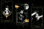
The Kpop Idol Tarot Cards are 100% made by me and they're really just place holders but it was worth it for the a e s t h e t i c s

> Relevant Images <
I didn't really have much in mind of text and color please forgive me I'm so tired it took a while to plan and make this
The Kpop Idol Tarot Cards are 100% made by me and they're really just place holders but it was worth it for the a e s t h e t i c s
SirNateUnknown
Master Of Boredom
Hello, I don't know if i did it detailed enough for the mock up but here is the first design i made, wanted something simple.
If able, i would like to please request for this to become an in character bbcode.
(I really really love your codes, they are my first go to for posts! I just- they are pure talent!)


1. Libre Bodoni (Music Title) #A78122 (All Caps lock & Bold)
2. Belgrano (artist) #FFFFFF
3. Libre Baskerville (everything else) #A78122 (location, interactions, Name.) (all caps lock (also bold for name))
#FFFFFF (for the rest of the text in the text box)
4. Mobile friendly if possible
Blank page and pic placeholder
click me
We can probably name this code "Midas"
Thank you for your time and all these amazing codes!
Last edited:
51. divine arcana
Uxie
ଘ(੭ˊ꒳ˋ)੭* ੈ‧₊❀˖°
divine arcana
cs
hidden scrolls
uxie ®
please leave a like if you use ♡
please do not remove the credit.
this code was made in collaboration with TerrorKitty
!
please click the below to see their design!
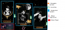
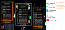
it should be mobile-friendly, albeit a little ugly! but there's a massive hidden scroll on the entire code, as well as on all textboxes. i've tried to indicate these as best as i could! ( ˙▿˙ ) the images used are of viviz, with the transparent edits made by orangx on deviantart
as usual, all colours & fonts can be changed through variables at the top.
thank you for requesting! (*^^*)♡
please do not remove the credit.
this code was made in collaboration with
please click the below to see their design!
it should be mobile-friendly, albeit a little ugly! but there's a massive hidden scroll on the entire code, as well as on all textboxes. i've tried to indicate these as best as i could! ( ˙▿˙ ) the images used are of viviz, with the transparent edits made by orangx on deviantart
as usual, all colours & fonts can be changed through variables at the top.
thank you for requesting! (*^^*)♡
scroll
Gotta Go
CHUNG HA
I
the
magician
category
hello
words
hello
words
hello
words
Lorem ipsum dolor sit amet, consectetur adipiscing elit. Phasellus porta lorem nec ligula varius vulputate. Cras mattis mauris id odio congue, sit amet faucibus purus congue. Ut justo felis, dignissim eu fermentum vestibulum, fringilla a mi. Proin vestibulum dignissim suscipit. Vivamus et vehicula orci. Sed nec velit a ipsum hendrerit bibendum. Proin blandit volutpat eros non convallis. Sed mauris purus, pulvinar sed dui euismod, tempus varius risus.
Lorem ipsum dolor sit amet, consectetur adipiscing elit. Quisque convallis sagittis justo, at sagittis urna egestas ac. Sed fermentum fringilla lacinia. Maecenas euismod non ipsum ut feugiat. Quisque fermentum sem sem, ac lacinia justo varius quis. Aliquam auctor interdum ante, eget vestibulum tellus pharetra quis. Integer efficitur ultrices vulputate. Duis sed tortor augue. Vivamus id ultricies tellus. Nulla rhoncus hendrerit neque, quis scelerisque justo viverra sit amet. Nam dolor libero, egestas consectetur auctor a, placerat quis sem. Phasellus vel mi sit amet odio efficitur tincidunt ac vitae tellus.
Lorem ipsum dolor sit amet, consectetur adipiscing elit. Quisque convallis sagittis justo, at sagittis urna egestas ac. Sed fermentum fringilla lacinia. Maecenas euismod non ipsum ut feugiat. Quisque fermentum sem sem, ac lacinia justo varius quis. Aliquam auctor interdum ante, eget vestibulum tellus pharetra quis. Integer efficitur ultrices vulputate. Duis sed tortor augue. Vivamus id ultricies tellus. Nulla rhoncus hendrerit neque, quis scelerisque justo viverra sit amet. Nam dolor libero, egestas consectetur auctor a, placerat quis sem. Phasellus vel mi sit amet odio efficitur tincidunt ac vitae tellus.
XVIII
the
moon
category
hello
words
hello
words
hello
words
Lorem ipsum dolor sit amet, consectetur adipiscing elit. Phasellus porta lorem nec ligula varius vulputate. Cras mattis mauris id odio congue, sit amet faucibus purus congue. Ut justo felis, dignissim eu fermentum vestibulum, fringilla a mi. Proin vestibulum dignissim suscipit. Vivamus et vehicula orci. Sed nec velit a ipsum hendrerit bibendum. Proin blandit volutpat eros non convallis. Sed mauris purus, pulvinar sed dui euismod, tempus varius risus.
Lorem ipsum dolor sit amet, consectetur adipiscing elit. Quisque convallis sagittis justo, at sagittis urna egestas ac. Sed fermentum fringilla lacinia. Maecenas euismod non ipsum ut feugiat. Quisque fermentum sem sem, ac lacinia justo varius quis. Aliquam auctor interdum ante, eget vestibulum tellus pharetra quis. Integer efficitur ultrices vulputate. Duis sed tortor augue. Vivamus id ultricies tellus. Nulla rhoncus hendrerit neque, quis scelerisque justo viverra sit amet. Nam dolor libero, egestas consectetur auctor a, placerat quis sem. Phasellus vel mi sit amet odio efficitur tincidunt ac vitae tellus.
Lorem ipsum dolor sit amet, consectetur adipiscing elit. Quisque convallis sagittis justo, at sagittis urna egestas ac. Sed fermentum fringilla lacinia. Maecenas euismod non ipsum ut feugiat. Quisque fermentum sem sem, ac lacinia justo varius quis. Aliquam auctor interdum ante, eget vestibulum tellus pharetra quis. Integer efficitur ultrices vulputate. Duis sed tortor augue. Vivamus id ultricies tellus. Nulla rhoncus hendrerit neque, quis scelerisque justo viverra sit amet. Nam dolor libero, egestas consectetur auctor a, placerat quis sem. Phasellus vel mi sit amet odio efficitur tincidunt ac vitae tellus.
III
the
empress
category
hello
words
hello
words
hello
words
Lorem ipsum dolor sit amet, consectetur adipiscing elit. Phasellus porta lorem nec ligula varius vulputate. Cras mattis mauris id odio congue, sit amet faucibus purus congue. Ut justo felis, dignissim eu fermentum vestibulum, fringilla a mi. Proin vestibulum dignissim suscipit. Vivamus et vehicula orci. Sed nec velit a ipsum hendrerit bibendum. Proin blandit volutpat eros non convallis. Sed mauris purus, pulvinar sed dui euismod, tempus varius risus.
Lorem ipsum dolor sit amet, consectetur adipiscing elit. Quisque convallis sagittis justo, at sagittis urna egestas ac. Sed fermentum fringilla lacinia. Maecenas euismod non ipsum ut feugiat. Quisque fermentum sem sem, ac lacinia justo varius quis. Aliquam auctor interdum ante, eget vestibulum tellus pharetra quis. Integer efficitur ultrices vulputate. Duis sed tortor augue. Vivamus id ultricies tellus. Nulla rhoncus hendrerit neque, quis scelerisque justo viverra sit amet. Nam dolor libero, egestas consectetur auctor a, placerat quis sem. Phasellus vel mi sit amet odio efficitur tincidunt ac vitae tellus.
Lorem ipsum dolor sit amet, consectetur adipiscing elit. Quisque convallis sagittis justo, at sagittis urna egestas ac. Sed fermentum fringilla lacinia. Maecenas euismod non ipsum ut feugiat. Quisque fermentum sem sem, ac lacinia justo varius quis. Aliquam auctor interdum ante, eget vestibulum tellus pharetra quis. Integer efficitur ultrices vulputate. Duis sed tortor augue. Vivamus id ultricies tellus. Nulla rhoncus hendrerit neque, quis scelerisque justo viverra sit amet. Nam dolor libero, egestas consectetur auctor a, placerat quis sem. Phasellus vel mi sit amet odio efficitur tincidunt ac vitae tellus.
Environment
Lorem ipsum dolor sit amet, consectetur adipiscing elit. Phasellus porta lorem nec ligula varius vulputate. Cras mattis mauris id odio congue, sit amet faucibus purus congue. Ut justo felis, dignissim eu fermentum vestibulum, fringilla a mi. Proin vestibulum dignissim suscipit. Vivamus et vehicula orci. Sed nec velit a ipsum hendrerit bibendum. Proin blandit volutpat eros non convallis. Sed mauris purus, pulvinar sed dui euismod, tempus varius risus.
Soil
Lorem ipsum dolor sit amet, consectetur adipiscing elit. Phasellus porta lorem nec ligula varius vulputate. Cras mattis mauris id odio congue, sit amet faucibus purus congue. Ut justo felis, dignissim eu fermentum vestibulum, fringilla a mi. Proin vestibulum dignissim suscipit. Vivamus et vehicula orci. Sed nec velit a ipsum hendrerit bibendum. Proin blandit volutpat eros non convallis. Sed mauris purus, pulvinar sed dui euismod, tempus varius risus.
Equipment
Lorem ipsum dolor sit amet, consectetur adipiscing elit. Phasellus porta lorem nec ligula varius vulputate. Cras mattis mauris id odio congue, sit amet faucibus purus congue. Ut justo felis, dignissim eu fermentum vestibulum, fringilla a mi. Proin vestibulum dignissim suscipit. Vivamus et vehicula orci. Sed nec velit a ipsum hendrerit bibendum. Proin blandit volutpat eros non convallis. Sed mauris purus, pulvinar sed dui euismod, tempus varius risus.
Picking
Lorem ipsum dolor sit amet, consectetur adipiscing elit. Phasellus porta lorem nec ligula varius vulputate. Cras mattis mauris id odio congue, sit amet faucibus purus congue. Ut justo felis, dignissim eu fermentum vestibulum, fringilla a mi. Proin vestibulum dignissim suscipit. Vivamus et vehicula orci. Sed nec velit a ipsum hendrerit bibendum. Proin blandit volutpat eros non convallis. Sed mauris purus, pulvinar sed dui euismod, tempus varius risus.
Answer
Lorem ipsum dolor sit amet, consectetur adipiscing elit. Phasellus porta lorem nec ligula varius vulputate. Cras mattis mauris id odio congue, sit amet faucibus purus congue. Ut justo felis, dignissim eu fermentum vestibulum, fringilla a mi. Proin vestibulum dignissim suscipit. Vivamus et vehicula orci. Sed nec velit a ipsum hendrerit bibendum. Proin blandit volutpat eros non convallis. Sed mauris purus, pulvinar sed dui euismod, tempus varius risus.
♡design by terrorkitty, coded by uxie♡
Last edited:
52. midas
Uxie
ଘ(੭ˊ꒳ˋ)੭* ੈ‧₊❀˖°
midas
ic
hidden scrolls
uxie ®
please leave a like if you use ♡
please do not remove the credit.
this code was made in collaboration with SirNateUnknown
!
please click the below to see their design!
a simple in-character code, which features a music player and a hidden scroll on the textbox! sirnateunknown kindly adjusted their design from the original to make it feasible within my capabilities, so thank you (* ^ ω ^) it should be mobile-friendly, and fairly easy to customise -- only two colours!
as usual, all colours & fonts can be changed through variables at the top.
thank you for requesting! (⌒▽⌒)♡
please do not remove the credit.
this code was made in collaboration with
please click the below to see their design!
a simple in-character code, which features a music player and a hidden scroll on the textbox! sirnateunknown kindly adjusted their design from the original to make it feasible within my capabilities, so thank you (* ^ ω ^) it should be mobile-friendly, and fairly easy to customise -- only two colours!
as usual, all colours & fonts can be changed through variables at the top.
thank you for requesting! (⌒▽⌒)♡
the hunter
Adam Jensen
location
Answer
interactions
Answer
Lorem ipsum dolor sit amet, consectetur adipiscing elit. Cras lobortis nisl quis ex consequat efficitur. Integer tempor vel magna ut ullamcorper. Curabitur rutrum pharetra nunc eu venenatis. Vestibulum a scelerisque odio, ut sollicitudin enim. Vestibulum augue elit, tempus ac pretium eu, ultrices et nisl. Cras id arcu a nunc aliquam commodo vel eget sem. Interdum et malesuada fames ac ante ipsum primis in faucibus. Duis eu malesuada nisi, at venenatis erat. Proin et metus ex. Nam sapien metus, iaculis at purus nec, ullamcorper posuere nisi.
Curabitur non lorem augue. Nunc convallis sollicitudin purus eu imperdiet. Proin ac rutrum diam, nec molestie nisi. Nullam in ipsum aliquet, viverra augue et, egestas nisi. Aliquam cursus mi dui, pretium molestie nisi elementum sed. Nullam convallis lacinia nunc, vitae facilisis purus semper pharetra. In consequat tincidunt molestie. Sed diam velit, sagittis non sapien id, scelerisque euismod nibh. Cras condimentum dolor a nunc eleifend fringilla. Etiam facilisis ligula massa, et dictum dui euismod nec.
Curabitur non lorem augue. Nunc convallis sollicitudin purus eu imperdiet. Proin ac rutrum diam, nec molestie nisi. Nullam in ipsum aliquet, viverra augue et, egestas nisi. Aliquam cursus mi dui, pretium molestie nisi elementum sed. Nullam convallis lacinia nunc, vitae facilisis purus semper pharetra. In consequat tincidunt molestie. Sed diam velit, sagittis non sapien id, scelerisque euismod nibh. Cras condimentum dolor a nunc eleifend fringilla. Etiam facilisis ligula massa, et dictum dui euismod nec.
name
♡design by sirnateunknown, coded by uxie♡
SirNateUnknown
Master Of Boredom
midas
ic
hidden scrolls
uxie ®
please leave a like if you use ♡
please do not remove the credit.
this code was made in collaboration withSirNateUnknown !
please click the below to see their design!
a simple in-character code, which features a music player and a hidden scroll on the textbox! sirnateunknown kindly adjusted their design from the original to make it feasible within my capabilities, so thank you (* ^ ω ^) it should be mobile-friendly, and fairly easy to customise -- only two colours!
as usual, all colours & fonts can be changed through variables at the top.
thank you for requesting! (⌒▽⌒)♡
the hunter
Adam Jensen
location
Answer
interactions
Answer
Lorem ipsum dolor sit amet, consectetur adipiscing elit. Cras lobortis nisl quis ex consequat efficitur. Integer tempor vel magna ut ullamcorper. Curabitur rutrum pharetra nunc eu venenatis. Vestibulum a scelerisque odio, ut sollicitudin enim. Vestibulum augue elit, tempus ac pretium eu, ultrices et nisl. Cras id arcu a nunc aliquam commodo vel eget sem. Interdum et malesuada fames ac ante ipsum primis in faucibus. Duis eu malesuada nisi, at venenatis erat. Proin et metus ex. Nam sapien metus, iaculis at purus nec, ullamcorper posuere nisi.
Curabitur non lorem augue. Nunc convallis sollicitudin purus eu imperdiet. Proin ac rutrum diam, nec molestie nisi. Nullam in ipsum aliquet, viverra augue et, egestas nisi. Aliquam cursus mi dui, pretium molestie nisi elementum sed. Nullam convallis lacinia nunc, vitae facilisis purus semper pharetra. In consequat tincidunt molestie. Sed diam velit, sagittis non sapien id, scelerisque euismod nibh. Cras condimentum dolor a nunc eleifend fringilla. Etiam facilisis ligula massa, et dictum dui euismod nec.
name
♡design by sirnateunknown, coded by uxie♡

just pure talent, i cant even- I love this so much! thank you again~

HowlingWoods
"And she heaved the forest upon her back"
Heyo! My second code request here, I keep looking everywhere for a good Victorian letter code and I can't find one so I figured I'd request a new one!
My initial idea/hope is kind of complex, I know, so I kind of simplified it in the mock-up, but hopefully you can still create something cool with it! Thank you dearly.
First image shows the final appearance, second image includes annotations.


Images Used: Stationery, Envelope. (Merged image if neccessary)
Note: I am not partial to the envelope texture used, if you can find a better one feel free to replace it! The stationery should stay the same though!
Note 2: If you can find an envelope texture with a closed/opened version, and maybe a wax seal, that'd be really awesome! It'd be cool to have it so you can click on the wax seal and the letter would animate opening, but IDK if that's doable so no worries if it isn't.
Fonts Used: Great Vibes is used in the mock-up, but I'd actually prefer the google font 'Square Peg'. I just can't get Square Peg on Canva. Great Vibes is an alright replacement, though!
Colors Used: N/A
Annotations:
From line 1 to line 2 should be one text box. No scroll necessary, but enough room to input a long first and last name if needed.
Line 2 to 3 should be one text box with a hidden scroll. It might be a bit difficult to work around the flower motif, if necessary you can raise the bottom line of the text box so it doesn't overlap the flowers and move the signature up accordingly, but I'd prefer if the box wasn't too small for readability purposes.
Line 3 to 4 should be one text box. No scroll necessary, but again, enough room to input a long first name and (if you can fit it) a last name as well.
Feel free to experiment with font sizes and what not, but legibility is important to me so keep that in mind, especially as we're working with handwritten fonts here!
P.S. If you can do anything to clean up the border between the envelope and the stationery, that'd be fantastic, but no worries if you can't!
My initial idea/hope is kind of complex, I know, so I kind of simplified it in the mock-up, but hopefully you can still create something cool with it! Thank you dearly.
53. ever faithful
Uxie
ଘ(੭ˊ꒳ˋ)੭* ੈ‧₊❀˖°
ever faithful
ic
accordion
hidden scrolls
uxie ®
please leave a like if you use ♡
please do not remove the credit.
this code was made in collaboration with HowlingWoods
!
please click the below to see their design!
an envelope accordion ic post that is more than a little janky but seems to work fine on mobile for the most part— some inevitable misalignments, but i hate accordions too much to attempt fixing it further ( ´ ω ` ) so sorry! if you happen to get any huge issue with it, please let me know though!
otherwise a simple code; the wax seal isn't customisable, but the symbol on the wax seal is customisable, and i've left some indicators on where to adjust the size of the letter's text if you happen to want to change it. a word of cautioo that i have based the sizing of the code to match the image i was given for the stationery-- the aspect ratio is approximately 1.30:1, so you can crop your image to that if you'd like! ( ˙▿˙ ) i.... would not recommend changing the letter images at all.
howlingwoods has requested a version that has a wider width of textbook for ease of customisation, so for those who would like that instead should you want to change the stationery, here it is: \(≧▽≦)/
thank you for requesting! (*¯︶¯*)
please do not remove the credit.
this code was made in collaboration with
please click the below to see their design!
an envelope accordion ic post that is more than a little janky but seems to work fine on mobile for the most part— some inevitable misalignments, but i hate accordions too much to attempt fixing it further ( ´ ω ` ) so sorry! if you happen to get any huge issue with it, please let me know though!
otherwise a simple code; the wax seal isn't customisable, but the symbol on the wax seal is customisable, and i've left some indicators on where to adjust the size of the letter's text if you happen to want to change it. a word of cautioo that i have based the sizing of the code to match the image i was given for the stationery-- the aspect ratio is approximately 1.30:1, so you can crop your image to that if you'd like! ( ˙▿˙ ) i.... would not recommend changing the letter images at all.
howlingwoods has requested a version that has a wider width of textbook for ease of customisation, so for those who would like that instead should you want to change the stationery, here it is: \(≧▽≦)/
thank you for requesting! (*¯︶¯*)
-
h1
-
click the wax seal!
S
-
h2
-
Dearest Lover,
Lorem ipsum dolor sit amet, consectetur adipiscing elit. Nam sollicitudin, justo ac maximus varius, libero velit sodales odio, eu elementum augue mauris in nulla. Vestibulum libero eros, ornare in mattis vel, vestibulum id massa. Sed et elit enim. Duis eget enim augue. Curabituru ultrices vestibulum ex. Curabitury egestas sapien et tellus commodo, a suscipit ipsum tristique. Suspendisse id ultricies justo, ut rutrum odio. Nulla facilisi. Suspendisse potenti. Suspendisse blandit vitae metus a finibus.
Nulla imperdiet justo sed aliquet fermentum. Sed laoreet, lectus vitae faucibus mollis, mi lacus porttitor dui, sit amet fringilla ante nulla ut ligula. Maecenas metus dolor, pellentesque quis elit quis, vulputate viverra dui. Proin aliquam tempor risus, vel commodo massa aliquet at. Vestibulum ante ipsum primis in faucibus orci luctus et ultrices posuere cubilia curae; Praesent auctor sapien placerat luctus ultricies. Suspendisse dapibus vehicula felis, id pellentesque eros ultricies at. Fusce sit amet orci sit amet sapien egestas suscipit sed quis odio. In congue libero nec justo tempus, eget bibendum lorem pharetra. Quisque rutrum orci quis velit fermentum volutpat. Aenean eget diam mollis, dictum ex quis, consequat turpis. Quisque quis justo ac ipsum gravida auctor nec commodo nunc. Curabitur suscipit eget diam et commodo. Mauris turpis velit, bibendum et felis sit amet, fringilla placerat arcu. Donec in leo semper, ultrices sapien consequat, sodales lacus. Sed lectus libero, commodo in consequat luctus, pellentesque tincidunt lectus.
Ever Faithful,
Your Lover
♡design by howlingwoods, coded by uxie♡
HowlingWoods
"And she heaved the forest upon her back"
Ac

AAAaaaaAAah I love it!!! Thank you!
ever faithful
ic
accordion
hidden scrolls
uxie ®
please leave a like if you use ♡
please do not remove the credit.
this code was made in collaboration withHowlingWoods !
please click the below to see their design!
an envelope accordion ic post that is more than a little janky but seems to work fine on mobile for the most part— some inevitable misalignments, but i hate accordions too much to attempt fixing it further ( ´ ω ` ) so sorry! if you happen to get any huge issue with it, please let me know though!
otherwise a simple code; the wax seal isn't customisable, but the symbol on the wax seal is customisable, and i've left some indicators on where to adjust the size of the letter's text if you happen to want to change it. a word of cautioo that i have based the sizing of the code to match the image i was given for the stationery-- the aspect ratio is approximately 1.30:1, so you can crop your image to that if you'd like! ( ˙▿˙ ) i.... would not recommend changing the letter images at all.
howlingwoods has requested a version that has a wider width of textbook for ease of customisation, so for those who would like that instead should you want to change the stationery, here it is: \(≧▽≦)/
thank you for requesting! (*¯︶¯*)
S
Dearest Lover,
Lorem ipsum dolor sit amet, consectetur adipiscing elit. Nam sollicitudin, justo ac maximus varius, libero velit sodales odio, eu elementum augue mauris in nulla. Vestibulum libero eros, ornare in mattis vel, vestibulum id massa. Sed et elit enim. Duis eget enim augue. Curabituru ultrices vestibulum ex. Curabitury egestas sapien et tellus commodo, a suscipit ipsum tristique. Suspendisse id ultricies justo, ut rutrum odio. Nulla facilisi. Suspendisse potenti. Suspendisse blandit vitae metus a finibus.
Nulla imperdiet justo sed aliquet fermentum. Sed laoreet, lectus vitae faucibus mollis, mi lacus porttitor dui, sit amet fringilla ante nulla ut ligula. Maecenas metus dolor, pellentesque quis elit quis, vulputate viverra dui. Proin aliquam tempor risus, vel commodo massa aliquet at. Vestibulum ante ipsum primis in faucibus orci luctus et ultrices posuere cubilia curae; Praesent auctor sapien placerat luctus ultricies. Suspendisse dapibus vehicula felis, id pellentesque eros ultricies at. Fusce sit amet orci sit amet sapien egestas suscipit sed quis odio. In congue libero nec justo tempus, eget bibendum lorem pharetra. Quisque rutrum orci quis velit fermentum volutpat. Aenean eget diam mollis, dictum ex quis, consequat turpis. Quisque quis justo ac ipsum gravida auctor nec commodo nunc. Curabitur suscipit eget diam et commodo. Mauris turpis velit, bibendum et felis sit amet, fringilla placerat arcu. Donec in leo semper, ultrices sapien consequat, sodales lacus. Sed lectus libero, commodo in consequat luctus, pellentesque tincidunt lectus.
Ever Faithful,
Your Lover
♡design by howlingwoods, coded by uxie♡
IceCave
Lucky Member
Lovely codes! I was hoping for a simple IC code with some hidden scrolls and a place for a picture, if it's not a bother.
(TW for the picture)


(TW for the picture)


54. dead island
Uxie
ଘ(੭ˊ꒳ˋ)੭* ੈ‧₊❀˖°
dead island
ic
hidden scrolls
uxie ®
please leave a like if you use ♡
please do not remove the credit.
this code was made in collaboration with IceCave
!
please click the below to see their design!
quickly done, since this was a relatively simple request! an in-character code relatively simple to customise-- only two colours! one in red, and one in black. („• ᴗ •„) there are hidden scrolls on the main textbox as well as on the details/footer, and i've also added instructions should you want to add a background colour (but remember to add a text colour, too!) as well as removing the blood splatter. the font used in the code is a little funky in that it's a little smaller than most other fonts, but i've added in a place for you to edit the font size as necessary as well~
thank you for requesting! ( ´ ▽ ` )
please do not remove the credit.
this code was made in collaboration with
please click the below to see their design!
quickly done, since this was a relatively simple request! an in-character code relatively simple to customise-- only two colours! one in red, and one in black. („• ᴗ •„) there are hidden scrolls on the main textbox as well as on the details/footer, and i've also added instructions should you want to add a background colour (but remember to add a text colour, too!) as well as removing the blood splatter. the font used in the code is a little funky in that it's a little smaller than most other fonts, but i've added in a place for you to edit the font size as necessary as well~
thank you for requesting! ( ´ ▽ ` )
first
name
]
Lorem ipsum dolor sit amet, consectetur adipiscing elit. Donec commodo bibendum tincidunt. Vivamus ex sapien, condimentum eget sollicitudin vitae, vehicula ut orci. Pellentesque sit amet lacus eu libero ultrices sagittis. Nam quis ultrices justo. Cras sed auctor tortor. Donec in sodales ante. Donec sit amet sapien id lacus lacinia sollicitudin eget bibendum quam. Vivamus lectus urna, consequat et orci vitae, iaculis dapibus lectus.
Vivamus eget feugiat tortor. Mauris faucibus cursus massa, vel sollicitudin leo ullamcorper luctus. Etiam vitae malesuada nisl. Mauris non luctus nibh, sed tristique eros. Praesent pellentesque lorem et odio porttitor condimentum. Vivamus pellentesque velit vitae luctus scelerisque. Vivamus porttitor blandit sapien ac tempus. Proin bibendum tortor vel ligula eleifend, sed pharetra justo consectetur. Curabitur accumsan erat vitae ipsum volutpat gravida et sodales dui. Morbi laoreet tellus sit amet urna mattis, at tincidunt tellus gravida. Pellentesque purus orci, porta vitae varius egestas, condimentum vel erat. Duis quis tincidunt ante. Aliquam nec varius nisi.
Donec sagittis feugiat pellentesque. Morbi a justo ac metus eleifend imperdiet sed sed nisi. Maecenas tincidunt molestie tellus, a interdum nisi laoreet id. Nulla ullamcorper risus vel ullamcorper maximus. Integer molestie vel ipsum at lacinia. Vestibulum mollis vitae quam non mattis. In pulvinar, tortor vel accumsan scelerisque, augue nisi sagittis arcu, sed rhoncus nisi neque non ligula. Curabitur vitae egestas lorem.
location | mood | interactions
fdsfs
fdsfs
♡design by riptide, coded by uxie♡
MisoraUni
Artist | Just a lil silly but mostly sleepy
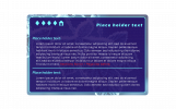
Hi, I designed a character sheet in the style of an ID card sort of thing. 

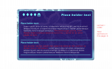
Notes/Instructions:
(I forgot the e in sexuality please put the e there lol)
Mobile friendly if possible!
The diamonds are tabs, the Home button shows up on the other tabs to go back to first page but it isn't on the first page.
Don't put any of the red text in the final, those are just instructions. xd
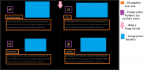
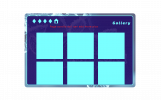
2 of the pages (there's 4 in total (5 if you count the home page)) are supposed to look like the 2nd layout image from above, they're basically just clones of each other so that's why I only designed the one.
I would like a 3rd page to have the same base layout (the title and diamond tabs +home) and one of those sections I designed at the top with the placeholder text etc. However, after that section I want this on the page, scrolling of course in case I need to add more sections:
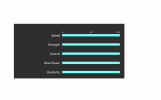
Please make it so I can change the length of the bars. (Also the bg behind the graphic is supposed be transparent, I just used a dark bg in case people are using light mode)
The 4th page is the gallery one, as I said in the graphic please make it scroll so I can add more pictures if I need to.
Please make it so I can copy paste the sections I designed if I feel the need to add more.
Also Please make it so I can change the colors of everything and any images/backgrounds so I can repurpose this for other characters, thank you.
Ps: if the rounded corners are too hard you can just do sharp corners I don't really care about that.
Idk how coding works in the slightest, only know how to do art so thank you very much for taking the time to do this for us no brain people. 


Notes/Instructions:
(I forgot the e in sexuality please put the e there lol)
Mobile friendly if possible!
The diamonds are tabs, the Home button shows up on the other tabs to go back to first page but it isn't on the first page.
Don't put any of the red text in the final, those are just instructions. xd
2 of the pages (there's 4 in total (5 if you count the home page)) are supposed to look like the 2nd layout image from above, they're basically just clones of each other so that's why I only designed the one.
I would like a 3rd page to have the same base layout (the title and diamond tabs +home) and one of those sections I designed at the top with the placeholder text etc. However, after that section I want this on the page, scrolling of course in case I need to add more sections:

Please make it so I can change the length of the bars. (Also the bg behind the graphic is supposed be transparent, I just used a dark bg in case people are using light mode)
The 4th page is the gallery one, as I said in the graphic please make it scroll so I can add more pictures if I need to.
Please make it so I can copy paste the sections I designed if I feel the need to add more.
Also Please make it so I can change the colors of everything and any images/backgrounds so I can repurpose this for other characters, thank you.
Ps: if the rounded corners are too hard you can just do sharp corners I don't really care about that.

Attachments
55. id card
Uxie
ଘ(੭ˊ꒳ˋ)੭* ੈ‧₊❀˖°
id card
cs
tabs
hidden scrolls
uxie ®
please leave a like if you use ♡
please do not remove the credit.
this code was made in collaboration with MisoraUni
!
please click the below to see their design!
a moderately simple cs code, but was slightly annoying to code because of janky bbcode. the diamonds are the tab buttons, and there are a lot of hidden scrolls-- just know it'll scroll on every tab for mobile, but i've otherwise tried to do it as per the layout!
thank you for requesting ♡
please do not remove the credit.
this code was made in collaboration with
please click the below to see their design!
a moderately simple cs code, but was slightly annoying to code because of janky bbcode. the diamonds are the tab buttons, and there are a lot of hidden scrolls-- just know it'll scroll on every tab for mobile, but i've otherwise tried to do it as per the layout!
thank you for requesting ♡
- filler tab, ignore!
Placeholder text
Placeholder text:
Lorem ipsum dolor sit amet, consectetur adipiscing elit. Vestibulum tincidunt vehicula pellentesque. Nam dui quam, congue et nulla eu, porttitor pretium mi. Maecenas ut urna quis diam lacinia rutrum. Aliquam finibus mi ex. Cras dignissim, ligula ut congue consequat, ante lectus pellentesque enim, sed bibendum quam tellus at nisi. Aliquam dapibus condimentum mauris quis ornare. Duis sed nisi tristique, elementum eros sed, lobortis lectus. Lorem ipsum dolor sit amet, consectetur adipiscing elit. Vestibulum tincidunt vehicula pellentesque. Nam dui quam, congue et nulla eu, porttitor pretium mi. Maecenas ut urna quis diam lacinia rutrum. Aliquam finibus mi ex. Cras dignissim, ligula ut congue consequat, ante lectus pellentesque enim, sed bibendum quam tellus at nisi. Aliquam dapibus condimentum mauris quis ornare. Duis sed nisi tristique, elementum eros sed, lobortis lectus.
Placeholder text
Placeholder text:
Lorem ipsum dolor sit amet, consectetur adipiscing elit. Vestibulum tincidunt vehicula pellentesque. Nam dui quam, congue et nulla eu, porttitor pretium mi. Maecenas ut urna quis diam lacinia rutrum. Aliquam finibus mi ex. Cras dignissim, ligula ut congue consequat, ante lectus pellentesque enim, sed bibendum quam tellus at nisi. Aliquam dapibus condimentum mauris quis ornare. Duis sed nisi tristique, elementum eros sed, lobortis lectus. Lorem ipsum dolor sit amet, consectetur adipiscing elit. Vestibulum tincidunt vehicula pellentesque. Nam dui quam, congue et nulla eu, porttitor pretium mi. Maecenas ut urna quis diam lacinia rutrum. Aliquam finibus mi ex. Cras dignissim, ligula ut congue consequat, ante lectus pellentesque enim, sed bibendum quam tellus at nisi. Aliquam dapibus condimentum mauris quis ornare. Duis sed nisi tristique, elementum eros sed, lobortis lectus.
050100
Speed
Strength
Control
Raw Power
Dexterity
Placeholder text
- filler tab, ignore!
Sexuality:
Answer
Mbti:
Answer
Mbti:
Answer
Name:
Answer
Age:
#
Dob:
##/##/####
Height:
Text here
Weight:
Text here
Gender:
Text here
Race:
Text here
Extra:
Lorem ipsum dolor sit amet, consectetur adipiscing elit. Vestibulum tincidunt vehicula pellentesque. Nam dui quam, congue et nulla eu, porttitor pretium mi.Country of Origin:
Lorem ipsum. This whole section will scroll!♡design by misorauni, coded by uxie♡
birth of venus
𝑒𝑣𝑖𝑙 𝑜𝑓 𝑚𝑦 𝑒𝑣𝑖𝑙.
/slides in respectfully
hello hello beloved, here's a big ol' interest check code request if you're still takin' requests and have the time!
i'm hoping for this to be a big ol' code, like 700 x 400 probably, and if its possible to be mobile friendly then that'd be incredible but also its enormous so if not then literally no worries. also i honestly just used random fonts but work sans and roboto or whatever are closest to helvetica would be totally fine!
here is the background pic
< 3

intro page -
if there is like way too much going on here / a function i'd like that wouldn't actually work, do let me know! otherwise, i'd like it if this was like the intro/initial look, and you click on the "accept" button to unlock the rest. if clicking the accept button could have it slide down to read the rest of the code, that would be super cool.

tab one -
the roman numerals on the side are the tab buttons, and this would be the first tab with just a large textbox for info, a small music player if it fits, and a sidebar with a short quote and image.

tab two -
tab two would be the roles tab. each little image card is meant to have a hidden scroll to reveal the text description, which would be lovely if that could scroll too. all of the role cards would be revealed with a horizontal scroll, with six total.

tab three -
tab three is just for the rules n such! nothing crazy here.

tab four -
and lastly, just another tab for extra information with some small icon-like images in it.
hello hello beloved, here's a big ol' interest check code request if you're still takin' requests and have the time!
i'm hoping for this to be a big ol' code, like 700 x 400 probably, and if its possible to be mobile friendly then that'd be incredible but also its enormous so if not then literally no worries. also i honestly just used random fonts but work sans and roboto or whatever are closest to helvetica would be totally fine!
here is the background pic
< 3

intro page -
if there is like way too much going on here / a function i'd like that wouldn't actually work, do let me know! otherwise, i'd like it if this was like the intro/initial look, and you click on the "accept" button to unlock the rest. if clicking the accept button could have it slide down to read the rest of the code, that would be super cool.

tab one -
the roman numerals on the side are the tab buttons, and this would be the first tab with just a large textbox for info, a small music player if it fits, and a sidebar with a short quote and image.

tab two -
tab two would be the roles tab. each little image card is meant to have a hidden scroll to reveal the text description, which would be lovely if that could scroll too. all of the role cards would be revealed with a horizontal scroll, with six total.

tab three -
tab three is just for the rules n such! nothing crazy here.

tab four -
and lastly, just another tab for extra information with some small icon-like images in it.
toriable2016
New Member
magnolias
tabs
hidden scrolls
uxie ®
please leave a like if you use ♡
please do not remove the credit.
inspired by jcnnie's jjong
edit (31.01): made the code friendlier to longer names
an ic i made a while back that i decided to make mobile-friendly not long ago, since i'm aiming for all ic posts that i make to be mobile-friendly! (´。• ᵕ •。`) click the icons for the details, and the outfit textbox is an accordion! pretty nifty
the only downsides are that on mobile, once you click on the buttons you won't be able to get rid of the little details thing, but i kinda prefer it that way. it's cute, just like u (o˘◡˘o) + the music player doesn't work on mobile because i got lazy to do the tabs workaround
also, belated thank you to nano for all the help with mobile-friendly flexboxes! she taught me a lot and i am now able to do wild things like this. luv u nano ♡
hope you like! (°◡°♡)
ye-won
filler
filler
filler
filler
filler
filler
blue.d
can i love?
Lorem ipsum dolor sit amet, consectetur adipiscing elit. Quisque facilisis quam sit amet maximus interdum. Cras felis justo, elementum ut sollicitudin et, condimentum at erat. Nulla risus mauris, consequat ut ipsum et, cursus gravida urna. Vivamus vulputate condimentum dolor a cursus. Pellentesque habitant morbi tristique senectus et netus et malesuada fames ac turpis egestas. Aenean scelerisque semper risus, in vulputate sem venenatis at. Suspendisse sed lectus bibendum, malesuada arcu et, laoreet magna. Ut nec tellus convallis, porta dui at, interdum nisl. Sed sem lorem, convallis id eleifend ac, vestibulum at tellus. Donec in nibh diam. Mauris vitae ante placerat, consectetur velit nec, interdum neque. Integer vitae sem ac felis vulputate interdum eget at nisl. In a tortor gravida, molestie justo sit amet, rutrum enim. Donec volutpat maximus justo non tincidunt."this is a dialogue,"
Pellentesque sed neque in massa tristique faucibus. Donec commodo, mi et porttitor molestie, nisl nunc tincidunt magna, eget posuere mi libero quis ipsum. Aenean convallis turpis quis ipsum tincidunt, eu porta enim laoreet. Nullam porta lorem id risus eleifend porta. Fusce lacinia iaculis euismod. Sed consectetur imperdiet tincidunt. In nec tincidunt urna. Donec vestibulum, dui at sagittis elementum, urna nunc sodales magna, et pretium metus nunc at nisl. In ultricies, lorem id convallis rhoncus, nisi metus pellentesque leo, ut sollicitudin tellus quam in erat. Nulla viverra felis ut tempus malesuada.
Sed tempus arcu convallis odio porta varius. Nam a velit in libero euismod imperdiet elementum quis tortor. Nulla vehicula lectus vel metus vehicula, ut scelerisque urna luctus. Donec et commodo elit. Sed molestie felis magna, eget tempus arcu luctus vel. Mauris vulputate euismod rhoncus. Pellentesque pretium arcu sed scelerisque finibus. Nullam mattis porttitor nisl. Nulla vitae porttitor ex. Ut semper sit amet velit id iaculis. Sed vestibulum egestas metus, at molestie augue dapibus id. Nunc faucibus, dolor sit amet rutrum consequat, odio velit molestie urna, sit amet blandit metus sem vitae lorem. Integer fringilla nunc in facilisis auctor.
♡coded by uxie♡
Love the code! I'm using it for one of my characters, but I'm having some problems with the music player. I replaced the link for the soundcloud code, but I am not able to play the song. Anyone have any ideas of what I am doing wrong?
Uxie
ଘ(੭ˊ꒳ˋ)੭* ੈ‧₊❀˖°
Love the code! I'm using it for one of my characters, but I'm having some problems with the music player. I replaced the link for the soundcloud code, but I am not able to play the song. Anyone have any ideas of what I am doing wrong?
hi dear, please refer to my music player guide under uxie's tech support here. if this doesn't fix your issue, please drop me a pm instead ♡
lostSoul
Ma'am
wow you're work is amazing my dear.  I used one of your codes for a request and hope I didn't make a mistake. Otherwise I will adapt it of course.
 I used one of your codes for a request and hope I didn't make a mistake. Otherwise I will adapt it of course.
Uxie
ଘ(੭ˊ꒳ˋ)੭* ੈ‧₊❀˖°
omg, hey!
uxie ®
hello dears ~ヾ(・ω・) happy holidays! it's been a hot minute.
i have an itch in my brain that i need to scratch but i don't have the mind to design atm, so i'm opening this back up for only 2 slots. most of my same rules in the first post of this shop apply; do take note before making a request!
a disclaimer: they'll be quick requests (meaning no edits, i'll just do whatever i see fit) and i'll admit i might be a little picky with them — i'm looking for designs i'll personally enjoy coding that are fun to code, pretty to look at, and won't be too tedious to make mobile-friendly. nevertheless, if you're a designer with a code layout collecting dust, please feel free to share ✧ if i don't accept it, no hard feelings please! (¯ ¯٥)
or maybe i don't have a clientele anymore. hehe. (¬ ¬ )
minajesty
she/her. ⋆𝜗𝜚
before i start, i'm sorry for my explanations beforehand.

- i'm really not at all picky when it comes to fonts (as long as they're changeable like how all of your codes are!!) but for the name on top and it's shadow text, maybe DM Serif Display??? the same can be set for the body text really. whatever you think best fits.
- the same can be applied to the hex codes for text color, i just made everything various grays to contrast against the black background. and speaking of backgrounds, if possible, i would like there to be none?? that way all of those changeable hex codes and such wouldn't be limited to whatever contrasts against it.
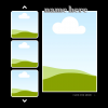
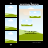
- the second outline is supposed to depict a hidden scroll box over the big image that kinda blurs it when everything is scrolled up??? that way it reveals two more picture options and then an entire body of text for whatever i choose to write there.
^ i also don't want that hidden scroll box to spill over as if the code is breaking. if it can all fit to the size of the big image it's scrolling over, that would be amazing!!
- the "click for more" text is just for aesthetic purposes, as if the viewer were "scrolling through" my character showcase, but that's not at all necessary. you can even delete it and utilize that space for your credits unless you decide to put it elsewhere.
- the arrows depicted on the left are also for aesthetic purposes, they don't have to scroll for more images!! three is enough.
- the design doesn't have to be made mobile friendly also since i work mostly from my laptop. but if you want it to be, by all means, go for it!!
to sum up; 6 image placeholders & a hidden scroll box over the big image on the left.
if this doesn't seem all that interesting or if it sounds like a hassle to code, please butcher it to fit your liking and experiment with whatever elements you choose!! i would just like to have a nice character showcase code so that i can stop procrastinating on working on my character glossary.
 thanks again for considering this, if you do!! x
56. every second
Uxie
ଘ(੭ˊ꒳ˋ)੭* ੈ‧₊❀˖°
every second
misc
scrolls
uxie ®
please leave a like if you use ♡
please do not remove the credit.
this code was made in collaboration with minajesty
!
please click the below to see their design!
a code for mina, so i've named it after mina okabe's every second __φ(..) i think this could be used as a placeholder too!
note the hidden scrolls on the big image on the right. i've added a small text shadow (it's invisible on dark mode,,) just so there's a bit of dimension on light mode (sue me!) as requested, the background is transparent, but you can add in a colour if you wish! the variables are all there for you to customise and all.
images are credited to tamimoon and nekokawaii1012.
thank you again for requesting! i said 2 slots before, but since this one was finished fast, i might take in more depending on how soon they're sent in |ʘ‿ʘ)╯
please do not remove the credit.
this code was made in collaboration with
please click the below to see their design!
a code for mina, so i've named it after mina okabe's every second __φ(..) i think this could be used as a placeholder too!
note the hidden scrolls on the big image on the right. i've added a small text shadow (it's invisible on dark mode,,) just so there's a bit of dimension on light mode (sue me!) as requested, the background is transparent, but you can add in a colour if you wish! the variables are all there for you to customise and all.
images are credited to tamimoon and nekokawaii1012.
thank you again for requesting! i said 2 slots before, but since this one was finished fast, i might take in more depending on how soon they're sent in |ʘ‿ʘ)╯
name here
scroll
Lorem ipsum dolor sit amet, consectetur adipiscing elit. Nam ex nisi, accumsan in sodales ac, tincidunt vel sapien. In non nisl at lectus lobortis placerat. Aenean pellentesque commodo mauris, id pellentesque erat blandit non. Duis quis elit felis. Donec bibendum luctus commodo. Aliquam ut vehicula turpis, vitae cursus eros. Donec nibh eros, semper vitae pellentesque et, elementum ut quam. Vivamus non feugiat tortor, vel hendrerit mauris. Donec molestie ultrices auctor. Suspendisse potenti. Aliquam erat volutpat.
click for more
♡design by minajesty, coded by uxie♡
Last edited:
minajesty
she/her. ⋆𝜗𝜚
i loveeeee.  thank you so much for the code, queen uxie!! you never disappoint.
 thank you so much for the code, queen uxie!! you never disappoint.
 AnimeQueenVA
Your Average VA
Heya! Coulod you make me some codes?
For some reason, my PC won't let me put in photos and I am a noob at coding, I will do a description of what I would like!
So, I have joined a Pokemon RP and I need six character sheets in one code for my Pokemon Team.
The first CS needs to look like a literal Winter Wonderland, the second CS needs to have unicorns and sparkles, the third CS should have ghosts, the fourth CS should have cotton and flowers, the fifth CS should have waves and the sixth CS should have fairies in it. It's fine if you cannot do it since it's a lot to do. But if you can, thank you so much!
Edit - I'm okay if you're gonna shorten it up a bit!
Another Edit - BTW, the name could be Journey
sunshineysoul
queen of bright-moon


Hello friend! I am swooping in here before it's too late. disclaimer: i've never designed codes before so I don't really know what I do and don't need to specify, but the pictures I put in the spoiler are my ideas for a code! I originally wanted it for my character showcase but I bet it could be used for a host of other purposes as well! I'll include a few things I have in mind in terms of this code:
- Whatever colors you think would work, i'm game for! I love how easy it is to switch out colors as needed in your codes, i just have blue and yellow in those pics bc they were first there on my canva whoops.
- I lovelovelove serif fonts, I don't really have exact names of fonts in mind (i know the big font for the name is Shrikhand on canva), so whatever you think would go well and look good, I will trust your beautiful mind
- I am imagining that this code has 2 scrolls; the first one being the transition between the first and second picture if that makes sense? it would scroll up to reveal the second picture + text box; then the second scroll being the text box itself
- Also, it doesn't have to be a massive, take up the entire screen sized code; i don't have sizes in mind, but again, i trust your experience and judgement!
- I'm not super hellbent on this being mobile-friendly, but i'm also not against it being mobile-friendly! whatever is easiest for you!
*definitely not mandatory, just an idea and question of "is it possible?" but instead of the blank background, is there a way that it could be a blurred picture or even pattern (that you could change urls of?) if not, that's totally okay!*
I totally understand if you're not up for coding this, but if you are then I am EXTREMELY grateful and 1000% trusting in your taste and judgement to uxie-fy the code however you think would be best!
Thanks for your consideration in advance !! Have a lovely day!
Uxie
ଘ(੭ˊ꒳ˋ)੭* ੈ‧₊❀˖°
Heya! Coulod you make me some codes?
For some reason, my PC won't let me put in photos and I am a noob at coding, I will do a description of what I would like!
So, I have joined a Pokemon RP and I need six character sheets in one code for my Pokemon Team.
The first CS needs to look like a literal Winter Wonderland, the second CS needs to have unicorns and sparkles, the third CS should have ghosts, the fourth CS should have cotton and flowers, the fifth CS should have waves and the sixth CS should have fairies in it. It's fine if you cannot do it since it's a lot to do. But if you can, thank you so much!
Edit - I'm okay if you're gonna shorten it up a bit!
Another Edit - BTW, the name could be Journey


Hello friend! I am swooping in here before it's too late. disclaimer: i've never designed codes before so I don't really know what I do and don't need to specify, but the pictures I put in the spoiler are my ideas for a code! I originally wanted it for my character showcase but I bet it could be used for a host of other purposes as well! I'll include a few things I have in mind in terms of this code:
- Whatever colors you think would work, i'm game for! I love how easy it is to switch out colors as needed in your codes, i just have blue and yellow in those pics bc they were first there on my canva whoops.
- I lovelovelove serif fonts, I don't really have exact names of fonts in mind (i know the big font for the name is Shrikhand on canva), so whatever you think would go well and look good, I will trust your beautiful mind
- I am imagining that this code has 2 scrolls; the first one being the transition between the first and second picture if that makes sense? it would scroll up to reveal the second picture + text box; then the second scroll being the text box itself
- Also, it doesn't have to be a massive, take up the entire screen sized code; i don't have sizes in mind, but again, i trust your experience and judgement!
- I'm not super hellbent on this being mobile-friendly, but i'm also not against it being mobile-friendly! whatever is easiest for you!
*definitely not mandatory, just an idea and question of "is it possible?" but instead of the blank background, is there a way that it could be a blurred picture or even pattern (that you could change urls of?) if not, that's totally okay!*
I totally understand if you're not up for coding this, but if you are then I am EXTREMELY grateful and 1000% trusting in your taste and judgement to uxie-fy the code however you think would be best!
Thanks for your consideration in advance !! Have a lovely day!
to both, thank you for your requests! i'll unfortunately be rejecting both due to lack of muse ( ´ д ` ) so very sorry. to the first requester, specifically, please refer to the very first post on this thread and make sure you adhere to guidelines in any future requests. thank you! (ノωヽ)
Users who are viewing this thread
Total: 5 (members: 1, guests: 4)
Similar threads
- Replies
- 37
- Views
- 761

