• When posting, please be aware that artistic nudity is still nudity and not allowed under RpNation rules. Please edit your pictures accordingly!

    Remember to credit artists when using work not your own.

Closed code machine go 𝙗𝙧𝙧𝙧𝙧 (by uxie)

sorry, but here’s another

49A3A51A-5987-4020-BAC3-2B6ABC866080.png
2E5AB9E9-A9E8-40DD-B666-6B1F2FDEAD37.png

anyways, another simple design,,
ignore the further most yellow outline idk how it happened aaggeheghhgh

+anyways i was hoping the font for everything would be varela round if possible, if not, then balsamiq sans
+the two dots on the bottom would be tabs for the first and second page, and like before, i’d like to keep it small & mobile friendly if possible
+I forgot to mention it, but I’m p sure it’s obvious, but on the first page that text box is the post, lol. that would scroll .v.
+the name, tabs, post, and picture would be outlined in black, if possible

sorry for all the ‘if possible’s i just don’t know what all will and won’t work gwgwfwfwf
in the comments for this, could you specify which colour is the yellow? when i would use this one, the background is subject to change colour, aha-

anyways tytytytytyytyt for the last one n i understand if this won’t work or sm


accepted!


uxie ®


back for more i see!!!! (¯▿¯)
don't worry about putting in "if possible"s but i can assure you everything you've designed is 100% feasible, though i'll def have to fiddle around to see as to how to make it mobile-friendly (⇀‸↼‶)
thank you for the request!!


8. lemon chiffon


lemon chiffon


hidden scrolls

ic

tabs


uxie ®


please leave a like if you use ♡
please do not remove the credit.


this code was made in collaboration with yourlocal-eboyy yourlocal-eboyy !
please click the below to see their design!

to start off, it's a VERY janky and VERY long design. it nearly killed me but im still standing... here.. . . .
it was so tough doing tabs like this mobile friendly!!! and i guess it kind of worked but the buttons are also not really aligned on phone but its okay!! its okay.... (。T ω T。)
the code is very long, and a large part of it i've put at the front is for aesthetics rather than functionality! i've labelled all of these as (ignore!), and the stuff you kind of have to care about starts from "actual content" onwards!
unfortunately the hexagon doesn't quite work on mobile, but i've made a sort of substitute. so hopefully that works instead. LOL (。T ω T。) haha....

the little buttons beneath the pictures are tabs that switch you between the post and the character details, and there are hidden scrolls on all the boxes. yay!
hope u enjoy!!! thank you to yourlocal-eboyy for submitting their second request!!!!

edit: this code has now been adjusted for light/dark mode. sorry about that!


– uxie


name here


filler


  • Lorem ipsum dolor sit amet, consectetur adipiscing elit. Nullam scelerisque leo et nisi tristique, non euismod sapien ultricies. Fusce interdum magna sit amet ornare sagittis. Pellentesque mi dolor, aliquam non elementum sodales, maximus consequat nunc. Quisque ut euismod massa, ut finibus turpis. Integer eget congue purus, at suscipit ex. Duis luctus suscipit lacus. Morbi aliquam ante non convallis malesuada.

    Pellentesque euismod leo ut arcu ultricies laoreet. Aliquam sit amet nisl ut purus euismod lobortis vitae sed neque. In blandit ac turpis vulputate dictum. Phasellus a pulvinar neque, sed sodales mi. Suspendisse sit amet sapien eu est finibus sagittis a ut diam. Vestibulum tempor consequat purus. Praesent faucibus ligula mi, non commodo orci lacinia id. Morbi rutrum justo felis, a mollis turpis pulvinar et.

    Fusce et scelerisque nunc. Suspendisse tristique nisi eget eros lacinia tincidunt sit amet id sapien. Praesent gravida eget dui sit amet pellentesque. Vestibulum molestie velit ac arcu egestas faucibus. Donec ac dictum sem. Lorem ipsum dolor sit amet, consectetur adipiscing elit. Curabitur tempor et nulla vitae sodales. Phasellus efficitur turpis id arcu congue dapibus. Phasellus bibendum justo eget orci iaculis elementum. Morbi cursus nec tellus sed lobortis. Suspendisse efficitur varius facilisis. Sed volutpat lacus a elit maximus eleifend. Nulla luctus egestas lorem, in ullamcorper dolor faucibus quis. Aliquam blandit velit vel dapibus aliquet.


content filler area (ignore!)


♡design by yourlocal-eboyy, coded by uxie♡
 
Last edited:
oh my goodness! i love this. words can’t describe how these are beautiful..i have a request. do you think you could do this?
a starry theme
in person
hidden scrolls
mobile friendly
light blue color theme?
 
hi there!! just wanted to pop in and see if i could submit a request. i am In Love with your codes and got inspiration for a cs code but realized it's a little out of my league. if this isn't doable, i 100% understand !!

- this is meant to be a character sheet code (though likely could double as an interest check code?) with either a hidden scroll or accordion (whichever is easier for you.) it's also heavily inspired by khevinday on tumblr.
- the first image is meant to be the cover of the cs. you scroll/click and it reveals the tabs of the code. there are four tabs in total, and i wasn't honestly sure how the format of the tabs themselves could be exactly, maybe you could insert images into each one?
- the closest fonts to the originals i could find are changa one, montserrat and roboto.
- the background is #f3f3f3, where it says "main title" is #dcd2c8, the rounded container is #ceae9a, where it says "title" in the actual tabs is #be8766, and the font color is #0b0b0b.
- the cover title and image don't need to scroll or anything, but could each tab have a hidden scroll for the textbox? i also marked where the tabs could be and what the buttons would look like, but if you have any better ideas for them (cause i made it super simple) pls feel free!

so yeah ! pls lmk if this can be done, i would appreciate it greatly. thank you! < 3
coderequest1.png

coderequest2.png
 
9. stargazing


stargazing


ic


hidden scrolls


uxie ®


please leave a like if you use ♡
please do not remove the credit.


hey xokenziee. xokenziee. , this one is for you!
i wasn't going to accept it initially but randomly had an idea for it, so here you are! since this felt more like a rapid-fire request rather than a collaboration, the credit for this code will lie solely with myself
(.❛ ᴗ ❛.)

haha just went on a whim x so this is 100% an anomaly i do NOT have the braincells for this
(눈_눈) so a gentle reminder that other requests of this nature are likely not to be accepted!! if you're looking for someone to also come up with a design for you, i'd recommend deer's shop or hannah's code workshop (a lil birdie told me she might be doing requests soon)

either way, this is a mobile-friendly ic code that features several hidden scrolls, with one on the main body content and on each of the individual details! you'll have to scroll them one by one but hey! at least you can put more things in there
it's a relatively simple one, but i think it looks kind of pretty. enjoy! ╰(*´︶`*)╯♡


– uxie


name here

role here


Lorem ipsum dolor sit amet, consectetur adipiscing elit. Proin sed neque elementum leo pharetra auctor. Vivamus id faucibus tellus. Nunc quis sapien sit amet tellus ultrices feugiat eget gravida ex. Nulla pharetra risus id leo porta, quis aliquet ante egestas. Quisque in condimentum leo. Nulla facilisi. Fusce imperdiet faucibus efficitur. Aenean mattis dui ornare, congue magna a, consequat dui. Vestibulum porttitor dolor eget lacus posuere rhoncus at eu quam. Donec sollicitudin feugiat ante quis dictum. Etiam porta, risus ut aliquet pretium, magna quam commodo nisl, sed tempor lectus libero eget nisl.

Quisque sed enim velit. Phasellus eget semper tortor. Pellentesque lobortis neque non nisl egestas lobortis. Suspendisse mi erat, tincidunt eget tortor eget, vestibulum cursus orci. Duis blandit enim sagittis congue ornare. Quisque at tellus fermentum, pulvinar nisi non, dictum diam. Duis id mi et ligula suscipit dictum at sed lectus. Vivamus vel sapien leo. Aliquam erat volutpat. Praesent eu auctor erat, eu mattis erat. Nulla vel finibus mi. Donec at tristique nisl, vel fringilla elit. Pellentesque eu sollicitudin orci. Nullam id ex tortor.

Sed ullamcorper metus vitae mauris ornare eleifend. Nulla non tempor mauris, vitae posuere ex. Vivamus mauris neque, venenatis quis elit in, malesuada iaculis ipsum. Orci varius natoque penatibus et magnis dis parturient montes, nascetur ridiculus mus. Curabitur condimentum justo eu porttitor tincidunt. Pellentesque eu porta tellus. Nullam elementum diam id massa hendrerit congue. Morbi sed rutrum eros. Phasellus felis est, lobortis in porttitor non, tempus ut ligula.


mood

tag tag tag


outfit

tag tag tag


interactions

tag tag tag


tags

tag tag tag


♡coded by uxie♡
 
Last edited:


accepted!


uxie ®


thank you for the request!
everything looks okay, so please expect a dm from me soon with more details (@^◡^)


10. chanel


chanel


hidden scrolls

tabs


cs/interest check


uxie ®


please leave a like if you use ♡
please do not remove the credit.

edit (24.11): fixed for safari compatibility. mac users rejoice! added on edit because i am a DUMBASS when you see this. recopy the code thank u.

this code was made in collaboration with low fidelity low fidelity !
please click the below to see their design!
this design was inspired by this tumblr theme pack

a cs code that can double as an interest check! thank you to low fidelity for submitting a cool design :")
click on the main title to see the rest of the code, which features 4 tabs and hidden scrolls on all of the text boxes + lots of fun images for you to use! as always, i've left hopefully enough comments to get you through customisation fairly easily. hopefully!!!!

hope you enjoy o( ❛ᴗ❛ )o


– uxie


  • this is where you'll put your


    main title!


    and this is the second, smaller subtitle. little bit.


♡design by low fidelity, coded by uxie♡

 
Last edited:
so i'm here requesting respectfully

um...here goes...

first things first i hate adobe with a burning passion and these turned out so poorly but i'm too angry to fix it them:
pic.jpg
(the name would go in line with the top right part of the diamond above the text box but adobe didn't want to add it. there would also be tabs but guess who didn't wanna add them. you guessed right)

Screen Shot 2020-10-21 at 9.08.18 PM.png

my indecisiveness
- i couldn't decide on one so i designed two options
- i have a cover designed but i didn't want to put 3 images in here so i'll message that one to you

colors and fonts
- you know how colorful i am---literally just black and white for colors (if i so desire i can change later)
- fonts? anything sans for the text box. for the name, either bebas neue or staatliches

tabs
- the first option i'd probably put tabs inside the text box since it would look awkward anywhere else. can either use 1 2 3 4 or fa-icons
- second option has the 4 small circles as tabs

pics
- pics to be different/change with each tab. i.e. the pic on the visage page is different than the one on the persona
- for the second design, maybe a small pic at the top of each text box, plus the circle. again, each pic to change as the tabs change

text boxes
- hidden scroll in all text boxes.
 
you're a goddess — and with your coding ability? idk if there's a word in the english language to describe how awesome you are. and bc you are awesome, i am respectfully requesting a code from the queen thx.

here is le design for each tab (i'm sORRY it's so long alskjdfh)

gurR2Rj.png
DKon305.png
KUHiQVb.png
opgDkxT.png
z0SJMCT.png

general:
- i'd love it if the design could be big hehe, so the dark background would fill the entire area and the main code could be of a medium-ish size in the centre.
- this is not going to be mobile friendly at all and it would be cruel of me to ask you to make it mobile friendly LOL so don't worry about that.

colours:
- main accent colour: #8b71aa
- background colour + secondary accent colour: #111111
- secondary background colour: #1e1e1e
- main text colour: #ffffff

fonts:
- main heading fonts: abril fatface
- subheading fonts: montserrat
- body font: rubik

tabs:
- i'd love it if the tab icons (in the little purple thingo right at top) cold be editable fa-icons! same with the icons on the main home page beside the basic info (basically, anywhere that i've used a heart or a house icon as placeholders LOL).
- as for scrolls, normal is fine! hidden scrolls tend to cut things off at one side on my laptop smh.
- and, uhh... i think that's it? i feel like i'm forgetting something but i can't remember what. but anyways, there it is!! tysm if u accept bby.


accepted!


uxie ®


oh my GODDDDDDDDDDDDDD
yes bitch!!!!!! yes!!!!!!!! ❤ (ɔˆз(ˆ⌣ˆc) pop off wit that graphic design degree LUVc
can't believe i get the honour of coding 4 my queen natasha hnngngggg


11. kiss me thru the phone


kiss me thru the phone


cs/interest


hidden scrolls

tabs


uxie ®


please leave a like if you use ♡
please do not remove the credit.

edit (24.11): fixed for safari compatibility. mac users rejoice!

this code was made in collaboration with iridescent. iridescent. !
please click the below to see their design!

broke naming convention just because she gave such a cool name ugh queen of names queen of designs
this can double as a character sheet or interest check code, depending on how you choose to use it!
click the big name on the first page to enter the rest of the code, and then the circles on the right are tabs too! though the alignment for them is kinda.. not right but it can't be helped. i am simply not elite enough to do that.

thank u haley for submitting a design hehe!!! enjoy (´,,•ω•,,)♡


– uxie


  • name here


    quote quote quote
    you can have this go a few lines


♡design by dreamglow, coded by uxie♡
 
Last edited:
12. purple prose


purple prose


cs

tabs


hidden scrolls


uxie ®


please leave a like if you use ♡
please do not remove the credit.


this code was made in collaboration with natasha. natasha. !
please click the below to see their design!

YEEEHAWW!!!!!
this code was so fun to do and incredibly satisfying to finish!!! it's another LOOONG boy which is why it was luxurious to finish honestly ( ̄▽ ̄)
i think it's really cool that nat's style is still so evident in her design too and i love this design to pieces, so i hope you enjoy it too!

five tabs in total, you can access them at the top! there are hidden scrolls on all of the text boxes, and i've given you Choice with the music player to choose between soundcloud and google drive (*¯︶¯*) just for fun
please keep submitting requests i love coding for yall thank u!!!
hope u enjoy ヽ(*・ω・)ノ

p.s. i put in a pretty song in the music player u should listen (ღ˘⌣˘ღ)


– uxie


filler


filler


filler


filler


  • lux.


    nasty quote!
    you can write a lil quote here
    4 lines max!
    aaaaaaaaa


    song name


    artist name


    character name

    character name here. this whole bit will scroll when you add more content!


    nickname(s)

    character nicknames here


    ethnicity

    Lorem ipsum dolor sit amet, consectetur adipiscing elit. Proin rutrum interdum velit a consequat. Sed posuere nisl dolor. Nullam ullamcorper mollis luctus. Mauris id mattis dui, eu eleifend augue. Donec consequat, mi in dignissim bibendum, urna est aliquam nisi, ac ultrices nisi ex vitae risus. Donec congue vel nisl eget vestibulum. Sed a feugiat nulla, vitae posuere enim. Quisque blandit neque leo, vel gravida lectus facilisis ut. Nullam pharetra sem ex, non ullamcorper nunc posuere quis. Vestibulum tellus eros, aliquam at tempor sit amet, blandit ut dolor.


♡design by natasha., coded by uxie♡

 
Last edited:
you QUEEN. you are so friggen AMAZING and i LOVE IT!! you really make me wanna cry by bringing that design to life so perfectly 😍 it is awesome and i will 1000% be parading this and your skills around, just u wait.

thank you so much for the magic you GODDESS!! ♥💕💗💝💓
 
uxie !! my absolute coding goddess !! it is I, your number one machine code brrr fan, and i've come to request those heavenly coding skills once again as a mere peasant designer. this time, i'm bringing forth a design for a cs code. pls bestow upon me ur astronomical powers as i am nothing but a clown soul 😔

here's the design for the whole code uwu
1.png 2.png 3.png 4.png 5.png 6.png

general:
- i had to crop the size of the images but i'd like the code to be p big :3
- i'd like every tab to b hidden scroll


colours & opacity:
-
the darker red is #8C1015
- the lighter red is #DF020B
- the opacity of the sidebar is 87%
- the opacity of the text box is 58%

fonts:
- for the name title [hanaera] i'd pick maybe roboto or ropa sans (but i'm no fonts expert dhaskj)
- for the tab titles on the side i'd pick either mukta in bold or century gothic in bold
- for the tab titles on the left & the tag [name] it's hammersmith one
- for the text you can pick either open sans or rubik

extra:
- for the background i used:
597029d64cde640d644b070c0f1aa171.jpg
- i can send u the other pictures later but i don't want to clock up the whole request with 10000 pictures LMAO
- that was it !! me think -- tell me if you are missing anything <3 <3 ilu and thank u so much in advance should u accept :3


accepted!


uxie ®


(´,,•ω•,,)♡ anni's first cs requesT!!!!
of course it's accepted o(>ω<)o thank u to my biggest fan hehe

also hyuna (´ ε ` )♡


kiss me thru the phone


cs/interest


hidden scrolls

tabs


uxie ®


please leave a like if you use ♡
please do not remove the credit.


this code was made in collaboration with iridescent. iridescent. !
please click the below to see their design!

broke naming convention just because she gave such a cool name ugh queen of names queen of designs
this can double as a character sheet or interest check code, depending on how you choose to use it!
click the big name on the first page to enter the rest of the code, and then the circles on the right are tabs too! though the alignment for them is kinda.. not right but it can't be helped. i am simply not elite enough to do that.

thank u haley for submitting a design hehe!!! enjoy (´,,•ω•,,)♡


– uxie


  • name here


    quote quote quote
    you can have this go a few lines


♡design by dreamglow, coded by uxie♡

still am in awe you agreed to name it kiss me thru the phone but i’m glad bc it’s a top notch name 14/10
everyone go listen to the song — kiss me thru the phone by soulja boy

anyways thank you so so much for this amazing code !!! am honored to have helped inspire this workshop idea ( :
 
13. love whisper


love whisper


cs

tabs


hidden scrolls


uxie ®


please leave a like if you use ♡
please do not remove the credit.

edit (12.01): im a dumbass and made a typo: minor edit to allow separated words for roles to stay on the same line!

this code was made in collaboration with neon reverie neon reverie !
please click the below to see their design!

tired brrrrrr noises!!!!!
thank you to anni for submitting such a pretty request for her fourth request in this thread! it's okay keep em coming queen this is a niche crowd and you are leading the charge (っ˘ω˘ς )

this is a character sheet code that features tabs and hidden scrolls! the tabs are obviously labelled on the left, and there are hidden scrolls on every single tab! yay!!! it wasn't too difficult to code but i think it turned out really pretty, as anni's designs always do haha

hope you enjoy! (*¯ ³¯*)♡


– uxie


basics

appearance

psyche

backstory

gallery


  • 여신


hanaera


♡design by neon reverie, coded by uxie♡
 
Last edited:
eeeee thank you so much for lending me your god-tier code skills again -- it looks absolutely AMAZING as always !!! <3 <3 can't believe that you managed to bring this design to life in SUCH a short amount of time too !! truly 1000000/10 service once again; WILL come back, WILL stan & WILL attest to these brilliant coding skills.

again thank you for taking on my design and doing your magic ilu my queen !! <3 <3
 
hello this makes my heart <333333 your work is so pretty and I kannot beleaf how accurate the coding turns out to be in comparison to the outline picture!! I am an ff refugee and seeing all these beautiful and and fancily functional codes give me so much 🥺. I dont have a request yet, but im sure I will be dropping one soon. itll be an easy one I promise! just a small posting template with minimalist vybes
 
hello ms. coding queen, once again respectfully requesting a code if you have the time 🥺 < 3 the last one i requested came out amazing & i have Ideas brewing

- this is meant to be an interest check code with four tabs! i was hoping this would be a rather large code (like around 900px by 550px? big boi).
- the first image is meant to be the first tab of the code, showing the title and a small two line quote. the second image is the second tab of the code, containing a subheader with a body of text that has hidden scroll. the third image is meant to be the third tab for lore, containing four 120px x 120px images with their own small bodies of texts, alternating left and right each (my explanations are so bad i'm so sorry hrhdjgk). the fourth image/tab is simply the same as the second tab.
- this code isn't actually very colorful, mainly all black and white (with half opacity black for the background half triangle and text box containers). i'm sorry the line sizes all seem inconsistent (for the lines around the main title, etc), canva is finnicky when it comes to changing line sizes. i'd like them to be 2px thick please.
- the cursive font used is called 'amsterdam three' and i doubt its actually a google font, so the mrs saint delafield font would be alright, as well as heebo thin for the two-line quote, and montserrat for the body text. (if it'd be possible to use a transparent png with the amsterdam three font in place of actual text titles, that'd be super cool! though i'm sure that would complicate this code even more, so it's not a necessity.)
- the four icons at the top are meant to be the tab buttons, it'd be lovely if they were fontawesome icons so they could be easily changed.

tab one:
momentssilence1-1.png


tab two:
momentssilence2.png


tab three:
momentssilence3.png


tab four:
momentssilence2.png


background:
photo-1502252430442-aac78f397426

i think that's everything, but pls lmk if you'd like me to clarify anything else. if this isn't feasible, pls no worries & thank u !! < 33


accepted!


uxie ®


second request and back again with another wicked design ( ´ ω ` )
your request is accepted! please expect a dm from me soon (¯▿¯)


14. common tongue


common tongue


interest check

hidden scrolls

tabs


uxie ®


please leave a like if you use ♡
please do not remove the credit.


this code was made in collaboration with low fidelity low fidelity !
please click the below to see their design!

low fidelity's second request!!!! i'm glad my work is good enough to have people coming back for more ヽ(*・ω・)ノ
this is an interest check code that can be done into a character sheet if you really wanted it to! featuring tabs (changed using the icons at the top) and hidden scrolls on all tabs! this includes tab 3 for lore and more, where you'll find the text accompanying each image scrolls as well!!!

thank you to low fidelity for submitting another request! it's always a pleasure working with them.
hope you enjoy ♡( ◡‿◡ )


– uxie


  • moment's silence


    "since it all begun to its reckoning, there the reason comes on the common tongue of you loving me."


♡design by low fidelity, coded by uxie♡
 
Last edited:
gurlll, your power amazes me <3 i can’t put in words about how good these codes are uwu
i am respectfully submitting another request, if it’s okay.


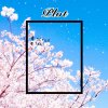
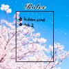
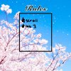
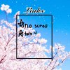
-I would like group an interest check code that has 4 tabs; one intro, one rules, one plot, one links
-color scheme is cherry blossom theme, so pink, blue would be fine.
-fonts...hm...raleway from google fonts? Or something that is fancy, like cursive
-reference images - here, or here.
- size may be medium to large.
-mobile friendly
- those heart thingies are supposed to be the tabs on the 1st one
- do you mind making the borders the same size? :grinningteeth:
C42CB61E-6BB9-4A74-9336-6C5436277783.jpeg08709DB0-1F41-460E-A80B-4A5CF5608DCB.jpeg35DFE8C2-97CD-4DAA-AAB4-EEDABEDC2FE2.jpegE30B649F-6F3C-492D-B82A-0572531084B1.jpeg55415C98-29F2-4275-95F3-E32AD61EF35B.jpeg
 
Last edited:

Users who are viewing this thread

  • Back
    Top