News & Updates Profile update: Roleplay Preferences

Have you ever met someone on the site and wondered if they were looking for rp, but were too shy to ask?
Wonder no more, as RpN just got a brand new quality of life update: Roleplay Preferences!

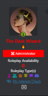
This is a neat little addition to the user profiles. It is intended to give you a quick reference on a user's basic roleplay preferences and availability. And if you need more information - you can click the link to see their interest check thread!

rp user details 2.png

Setting up​


Head to your Account details and scroll down a bit. You will see a colorful new section! Customize your RpN profile and show off what kind of roleplayer you are!

Here is a quick overview of what you can set there (screenshots are from Dark Mode but they look the same in Light Mode):


Roleplay Availability​

Roleplay Availability will let you show if you're currently looking for rp partners or recruiting for your group rp! And if you're not available we have this covered too! Only one option can be selected (you either look for rp or you don't, doh!)


rp availability.png


Roleplay Type(s)​

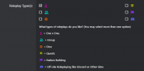
Do you prefer 1x1 or enjoy Group roleplays the most? Or maybe you're a fan of Dice systems? Or prefer to take the rp off-site and set up your own Discord server?
You can set all your preferred Roleplay Types! You can pick all of them if you'd like!

rp types.png


My Interest Check​

After setting up you preferences you might want to direct your potential rp partners to your interest check, right? And you can do so right in your Profile as well!
Simply put up the link to your thread in this section!

But what if I have 10 search threads, you might ask? Well, we do have a 24 hour rule per thread in place :) Only one at a time! Choose your favorite!


rp interest check link.png


And with that, you're all set!


Where do I check someone's RP Preferences?​


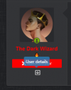
Whenever you browse the forums you can click a small arrow next to a user's name and see their Roleplay Preferences!
You can also see them if you check the About section of the user's Profile.


rp user details.png


Who knows, maybe you'll find a new rp partner while browsing General Discussion ;)


Happy roleplaying!​

 
Last edited:
I wanna be happy, I really do and I don't want to be negative but, this was a feature back in the day more or less and should not have been removed in the first place. That being said I've been saying they should bring it back so overall, awesome.
 
Indeed it was, but unfortunately due to various software changes it was removed. But we brought it back when it became possible to do so! :)
 
Indeed it was, but unfortunately due to various software changes, it was removed. But we brought it back when it became possible to do so! :)
Just a suggestion for the next update maybe you could also reintroduce the feature where you display the genre of RP you enjoy doing to make it easier for people to find like-minded people who have the same interest. I mean this is a good start but I do remember that being a thing and currently the categories are kind of broad I think it would narrow it down a bit more for people.
 
Just a suggestion for the next update maybe you could also reintroduce the feature where you display the genre of RP you enjoy doing to make it easier for people to find like-minded people who have the same interest. I mean this is a good start but I do remember that being a thing and currently the categories are kind of broad I think it would narrow it down a bit more for people.

Thank you for the suggestion!

This is definitely not the last update, so keep an eye on them!
 
One thing I want to comment, which pertains to my personal situation / status. I am typically not someone who is specifically looking for a roleplay (as in I am not actively looking) but that doesn't mean I am not open to getting a new roleplay. I feel like something to indicate a passive search or maybe better phrased "open but not looking" is missing. The existing options give the impression that you are actively searching or that you aren't open to RPs at all, but the fact of the matter is there is that in-between state.

You might want to consider adding that option, food for thought, and in the meantime I've opted to not select any.

Thanks for the comment!
When planning out this update we were discussing a similar thing and assumed that 'not actively looking' would still fall under 'not looking', and there is still a possibility to add link to a search thread as well in case there is one for passive search. But we listen to user feedback and if later it feels like we missed the point, we'll consider updating the options.

Alright. Then I'll just stress the consideration I mentioned that what comes across on the option "not looking" is not going to be "I am not actively looking but feel free to check my interest check and maybe we can work something out" or anything to that effect, but rather "I am not looking so don't bother asking, I am not interested / I don't have the time".
 
It's a cool feature. Thanks for it. I was wondering though, about a feature that can distinguish between whether someone is looking for let's say something advanced for multiple paragraphs or casual for one liners/paragraph/sentences or something in between? It would help when looking over confusing request threads.
 
I will agree that this is a great and helpful feature. Thank you, team, for bringing this back!
 
Just a suggestion for the next update maybe you could also reintroduce the feature where you display the genre of RP you enjoy doing to make it easier for people to find like-minded people who have the same interest. I mean this is a good start but I do remember that being a thing and currently the categories are kind of broad I think it would narrow it down a bit more for people.

I'm relatively new so no idea what was on before but my first instinct when I saw it now was that it needed the genres people are interested in roleplaying.
 
It's a cool feature. Thanks for it. I was wondering though, about a feature that can distinguish between whether someone is looking for let's say something advanced for multiple paragraphs or casual for one liners/paragraph/sentences or something in between? It would help when looking over confusing request threads.

We didn't want to add too many things, or it would clutter the sidebar and negate the point of request threads existing. If something is confusing, always feel free to ask for clarification in the person's thread or send them a polite PM inquiring for more info!

It's supposed to be a useful quick glance at quality of life change, not a complete replacement.

I'm relatively new so no idea what was on before but my first instinct when I saw it now was that it needed the genres people are interested in roleplaying.

Most people mention in the recruitment section, what they want to do :).
 
Even though I am coming back and forth here, just like to add that this is a wonderful addition to RpN, and glad that it has been brought back. 🥰
 
Oooooh, excellent work on this update! I'll need to head right over and add this 👀

Of course I don't expect anything, but is it possible to add a "small group" type of display? I say this because I tend to write with the same small group of people or very specifically with smaller groups because bigger groups are hard to manage/interact with. Of course, I'm fine with only having the one "group" option, haha, but just something I was wondering!
 
Thanks everyone for suggestions on other options. We'll definitely consider them if we feel current system needs to be expanded.

But to add to what The Dark Wizard The Dark Wizard already said, we intended this as quick 'reference sheet' and not including too many options was a conscious choice, to avoid cluttering user info. There is a possibility to add link to the search thread now, and all other information will likely be listed there.
 
Is it normal for all usernames to be leaning into three columns ? It just happened to me after reloading the page
 
Oooh, more buttons to press!
I love the return of this feature and the icons make for a simple, quick, and easy use!

On desktop/laptop, it looks amazing!

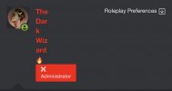
I think on mobile it's slightly a lil' wonky, I didn't notice it at first since I usually set my 'zoom' preference to 75%. I was curious to view at 100% and it seems the username and roleplaying preference are slightly squished together due to the columns.

I have an iPhone XS and my default browser is Safari.

IMG_4589.jpeg

IMG_4587.jpeg
IMG_4588.jpeg

I don't think this is a glaring issue as it's more aesthetic. But, is there a way for mobile-users to have the set-up on mobile arranged where the Username is on-top and the Roleplaying Preference is viewed at the bottom much like on laptop/desktop?
 
Oooh, more buttons to press!
I love the return of this feature and the icons make for a simple, quick, and easy use!

On desktop/laptop, it looks amazing!

I think on mobile it's slightly a lil' wonky, I didn't notice it at first since I usually set my 'zoom' preference to 75%. I was curious to view at 100% and it seems the username and roleplaying preference are slightly squished together due to the columns.

I have an iPhone XS and my default browser is Safari.


I don't think this is a glaring issue as it's more aesthetic. But, is there a way for mobile-users to have the set-up on mobile arranged where the Username is on-top and the Roleplaying Preference is viewed at the bottom much like on laptop/desktop?

Will definitely look into it, thanks for bringing it up!
 
Oooh, more buttons to press!
I love the return of this feature and the icons make for a simple, quick, and easy use!

On desktop/laptop, it looks amazing!

I think on mobile it's slightly a lil' wonky, I didn't notice it at first since I usually set my 'zoom' preference to 75%. I was curious to view at 100% and it seems the username and roleplaying preference are slightly squished together due to the columns.

I have an iPhone XS and my default browser is Safari.


I don't think this is a glaring issue as it's more aesthetic. But, is there a way for mobile-users to have the set-up on mobile arranged where the Username is on-top and the Roleplaying Preference is viewed at the bottom much like on laptop/desktop?
Will definitely look into it, thanks for bringing it up!
I've removed the word "Roleplay Preferences" for the time being as I work on it, until it's fixed.
 
As someone who is shy when it comes to asking to role play, I think this feature is amazing! Now I don't have to be as timid to meet new people!
 
Very useful as this is a new site for me. Takes a little more navigating compared to ff.net, which has a simpler format haha
 

Users who are viewing this thread

Back
Top