• When posting, please be aware that artistic nudity is still nudity and not allowed under RpNation rules. Please edit your pictures accordingly!

    Remember to credit artists when using work not your own.

Digital From the frying pan into the fire! Phadia's improvement... thingy?

Hey everyone! So, firstly... I'm not back. I'm here right now, but I've been in and out of hospital. So I'm not back back. Just popping in.
... and the reason I'm popping in is THIS.
I've been struggling to see my art as any good lately. I keep only seeing flaws. I'm not good at color schemes. I don't make enough contrast. I have to look at reference pics... etc. I keep critisizing my art lately.
But tonight, I was bored and full of energy (for once) and decided to take a stab and redrawing one of my old drawings.
I'm pretty stunned by the level of improvement.
Am I where I want to be? No. But I sure have made progress! I guess it was encouraging to see, so I decided to share.
VOID2 (2).png
Mask SM.png
 
hot diggity damn that's some improvement and a half. I love the spooky elements of your art and how it feels very autumnal? Especially with your colour schemes— makes me hyped for halloween now (as if I wasn't already)
 
Do you watch Solar Sands? This tread has very strong SS vibes.

Good work, though! Mm. Mm. You improved a lot. Now I'll try to copy you and actually work on my skills instead of giving up on myself. Thanks for the inspiration.

I don't know why I said "Mm. Mm." it just kinda happened and I went along with it.

One thing, though. Is the horn floating over the head?
 
Your progress is impressive! Especially can be seen when you compared two pictures recently.
Keep it up!
 
Apparently I'm just on a painting binge lately lol. Attempt #2 at mountains. Idk if I like either of them, but it's practice and it's something.Pond SM.png
 
the landscape with lavender field is my favourite ^^ I like the colors and composition a lot and the mountains look great!

First landscape is nice, but unnaturally bright, which is a bit offputting (for me), although I like the composition there! But I much more prefer the 3rd one to the 1st one because of the colors, they're dulled and look more natural.
Thanks for the feedback! I was using a color pallet from something else, but I agree. It's a bit bright in hindsight. I'm a big fan of autumn colors, so I'm planning on trying to perfect an autumn pallet that isn't so bright.
 
I think the trees are fine, it's mostly the grass that is too bright. maybe if you use darker colors for the grass and also add some bits of yellow and orange it will look more natural ^^

you're definitely improving and it's great. good luck!
 
Welp. I haven't been on here in... ages. Haven't touched Photoshop in months.
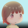
Decided to do a quick sketch tonight... which turned into my latest avatar. XD
So much for a quick sketch.

I'm actually very pleased with this one. Has a very Ghibli feel that I'm honestly proud of. Was also heavily Made in Abyss inspired. :PI may or may not have traced the one cheek. Shh!

I used a few new techniques I'd learned recently, but I was also just playing around a lot. I discovered some things that will be huge game changers for future art. Namely, more functionality with the Path tool, and clipping masks. <3 My new love lol.

Though there's a few cons with this piece, I'm overall pleased with it. Still, I need to point out the cons. The lineart is choppy. Not because it's not smooth, but because there were bits that got erased by mistake, and bits that should have been erased but weren't (you can see that much more in the below image than in the avatar). I just wasn't careful with it because this was supposed to just be a quick sketch. In the future, I will be ensuring the lineart is more refined.
The eyes are... not quite even, either.
Again, this was meant to be a quick sketch. Had I intended to do a proper drawing, I would have probably gone back and fixed the eyes from the get go. Yet, I don't feel that they're uneven enough to detract from the entire piece. It's more so a gripe on my end, I think.

Though I feel like I "cheated" a lot on this "quick sketch" the stuff I learned from doing it was invaluable. So, even if the end result isn't perfect, the process was 100% worth doing.

For those curious, this was done with both a pressure sensitive screen/pen combo, as well as the mouse with the Path tool. I like this combo a lot for art.

EDIT: Also, can I just say how happy I am to back to my chibi style? It's just so much nicer imo. My last couple portraits were not chibi enough.

SM Kiko with gradient.png
 
Last edited:
Q&A Time! Because... why not? I just pulled an accidental all-nighter and have nothing better to do... plsputmeoutofmymisery.

Q: What program do you use?
A: I use Adobe Photoshop CC. However, before that, I used GIMP. They are very comparable, but GIMP is free, while PS requires a monthly payment.

Q: Which drawing software do you recommend?
A: If you can afford Photoshop, it's definitely the best. It's very intuitive (that is, if you've used any sort of drawing program before), there's MANY tutorials on YouTube if you need them, and it has many features that are hard to find elsewhere. GIMP is second best, being free. Paint.NET is another good (and free) software. Basically, just avoid MS Paint. Please.

Q: How long does it take to draw a portrait?
A: I've never timed myself to the second, but it used to take me an entire day to do a single drawing. Now, I can draw something from the beginning (that is, character conception) in a couple hours, max.

Q: Why do none of your characters have eyebrows?!
A: Because I hate the stereotypical eyebrows-showing-through-hair thing that many anime style drawings use. If the character has bangs (like most of my characters do) the bangs would cover the eyebrows, making them invisible. There are some characters that I've drawn where the eyebrows could potentially show, but because I've drawn characters without eyebrows for so long, I like to consider it part of my style now. :)

Q: How can I get better at art?
A: Unlike most everyone else, I'm actually not going to answer with the overused "practice makes perfect". I have a theory (any experts out there, correct me if I'm wrong!) that our skills can improve simply via exposure. While this may not work for everybody, I've found that for myself, my skills have improved simply by watching videos of other people drawing, browsing different reference pictures, or critiquing others' work. Even without drawing yourself, you gain numerous things from watching others. You might recognize what colors go well together. You might notice "flaws" and then be sure to avoid them in your own work. You might learn techniques that can make something that used to take hours, take only minutes.
I very rarely sit down and "practice" drawing. In fact, I draw very rarely. But by the time I pick up my pen again, I'm ready to put the skills I've absorbed to use. I (almost) always see improvement between drawings.

Q: Really, though. My art sucks. Everyone can draw ______ but me! Or whenever I draw _____ it looks like crap. How can I fix this?
A: That, my friend, is your inner critic talking. While you may not be the level you want to be (I'm sure not!), that does not mean your art sucks. This is a pill I still struggle to swallow, because, even now, I still think my art is crap. For example, maybe I can draw faces, but I can't draw animals worth crap. Or maybe I can draw really great cats, but my hands look like deformed twigs. Everyone (yes, everyone) will have something they can draw really easily, and something that makes you want to snap your pencil in half and stab yourself with it. There may even be more than one "something".
The best advice I can give you is to figure out your own strengths and weaknesses.
For me, I'm terrible at drawing anything realistic. But luckily for me, I'm not a fan of realistic art. I enjoy drawing cartoon/anime style art. On the other hand, I used to be terrible at faces (*cough cough* my first post *cough cough*) so I decided to focus solely on that. Now, drawing faces is much easier for me. So, you can either choose to avoid your weakness, or to build on it. I'd recommend a bit of both. :)

Q: Do you really need a tablet and/or touch screen to do good art?
A: I'm sure there are people out there that can do stunning art with a mouse. I am not among them. Once I got a touchscreen laptop with a pen, my art took a MASSIVE leap in quality. Though I still use the mouse for some things, I'm not actually drawing the line with the mouse. I sketch with the pen first, and use the mouse to touch things up using the Path tool. This seems to be the best method I've found so far. So, while you could potentially do good art with a mouse... I would really recommend trying a tablet or touchscreen computer.

Q: Is it cheating to use reference pictures?
A: No, no, no, no and NO. Reference pictures are your BEST FRIEND. I used to just draw whatever was in my head. Big mistake. Using a reference pic (or many) helps you get the proportions right, helps you find colors that look nice together, and overall just really improves the quality of your art. Even really good artists, when the try to draw simple things from memory, often get it massively wrong. Our memories just aren't that great.
I think I used to avoid reference pics because I was concerned that it would be "copying" somebody else's art. In my opinion, as long as you're not copying the picture completely, it's okay to borrow things from it. For example, I usually have one reference picture that I use just for colors, one that I use for head position, one that I use for style (clothing or hair), and one that I use for eyes. This may be controversially among some, but this is what I like to do, and it works for me.

Q: What about tracing? Is that okay?
A: Honestly, I don't think tracing is a good idea. I mean, it's good if you're just learning how to draw something for the first time, and you want to practice said thing. But to make an actual finished drawing? It's basically stealing someone else's shape. I used a bit of tracing in my most recent avatar, but that picture was also supposed to only be a quick sketch. Plus, I only traced a few parts, not the whole thing. In general, though, I wouldn't trace anything. This is only my opinion, though.

Q: What about colors? There's so many color theory videos, my brain is about to explode. How can I get better at picking colors that go together?
A: Please don't leave brain chunks on my post. It's rather rude. Anyway, color is one of those things that you either have an eye for, or you don't in my opinion. And it can come in degrees as well.
You could be the type of person that uses every eye-bleedingly bright color under the sun in every one of your drawings. Or you could be the type of person that just uses a few ill fitting colors. Likewise, you could have a general good taste in colors, or you could be some sort of art major that narrows each color down to the hex code.
For me, I like to think that I fall somewhere in the average range of coloring skills. But what makes my colors look much better now than when I first started drawing, is a little thing I like to call the Diagonal Step.
I learned this from a video, but basically, let's say you color your shirt in a brown color. Usually, you would just drag the eyedropper straight down towards the black to make a shadow on the shirt, right? Instead of dragging it straight down, drag it down and right. Or down and left. Depending on your software, how you have your color picker laid out, and the overall mood of your drawing. You're basically trying to make (for example) a more blue-brown for the shadow. And a more yellow-brown for the highlight. Nothing crazy, but adding a different color to your shadows and highlights (as opposed to just changing the shade) gives a real life and depth to your drawing.
Trying to add small hints of different colors throughout your drawing is another great way to make colors look nicer. For example, I added the red to the brown hair in my avatar. Added purple to the pink eyes. Added green to the yellow shirt.
Contrasting colors can also look really nice when done sparingly. Yellow flecks in blue eyes, for example.
Again, this is where reference pictures are amazing. Find colors that you like in a drawing, and them incorporate them.
It doesn't need to be crazy complicated.
Another tip I've picked up over the years is to just avoid pure black and pure white. Pretty much nothing you see in real life is pure black or white. It's yellowy off-white. Or a dark gray. Or a pale blue. Or a dark reddish-brown. Avoiding pure black and white can really help things blend better and look nicer overall.
The only exception to this would be in some line art. Even then, though, it just looks better to use anything but pure black.

Summary (+ a few extra tips)
1. Spend time with what you love to draw! If you love drawing rocks, go walk on a dried river bed. If you love drawing anime faces, watch lots of anime. If you love drawing dogs, collect different dog plushies, walk dogs, or hoard images of dogs on your phone. Like I said before, your brain builds your skills unconsciously. The more time you spend with the thing you want to draw, the more details you'll notice about it, and the better you'll get at replicating it.
2. Avoid using pure white and black in your art.
3. Get a touch screen or tablet.
4. Anything that isn't MS paint will make your art look better.
5. Use the Diagonal Step trick (adding blue-brown shadows to your brown shirt, instead of just darker brown) to make your drawings pop.
6. Work on a large canvas. I literally use a HUGE canvas. I think it's like 6000 x 6000 px or something crazy. You can always make it smaller, but if you work on a small canvas from the get to, and try to make it bigger....? Well, it's gonna end up distorted, blurred, and just overall crappy.
7. Learn Blending Modes and how to use them (Multiply, Screen, Luminosity, etc.).
8. If you want to practice every day, go for it! But if you can't? Draw when you want to. Compare your new art to your old (as opposed to comparing it to others'). You will see improvements.
9. One crappy drawing =/= one crappy artist. You might even *gasp* sometimes take a few steps backwards. That is okay.
10. Watch lots of drawing videos. Even if they are traditional art, and you do digital (or vice versa) you might learn something from it.
11. Don't be afraid to try something new. Always draw pointed hair? Try rounded. Always draw a dot for a nose? Try shading and 'painting' it in. Even if all you get is a terrible picture, at least you've learned something to avoid in future art.
12. Don't give up! Breaks are okay. Even long (months or years) breaks are okay. But don't just say "I suck, I'm not gonna draw ever again." because of one mistake. Take a break and try again later.
13. Reference pics are not illegal. Use them.
 

Users who are viewing this thread

Back
Top